- Use a spinner whenever the wait anticipated wait time is between 2 and 5 seconds.
- Use when retrieving data or performing slow computations to notify the user that their request is being processed.
Spinner
A spinner is a visual element that indicates an ongoing activity or loading progress.
Dos and don'ts
- Avoid showing multiple spinners on a single page.
Anatomy

- Spinner: Visual indicator that continuously animates.
Variants
Brand

Secondary

Secondary dark
Inverse

Inverse light
Size
Outlines the spinner sizes that are available, and where they should be used across our products.
| Size | Height | Width | Use cases |
|---|---|---|---|
| XLarge | 48px | 48px | Use when an entire page requires a spinner |
| Large | 32px | 32px | |
| Medium | 24px | 24px | The default size. We recommend using this size where space allows. |
| Small | 20px | 20px | Use within small components such as buttons or chips, or when there are other space constraints. |
| XSmall | 16px | 16px |
Placement
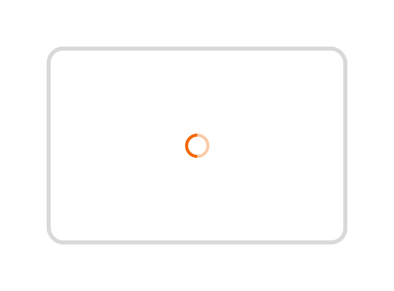
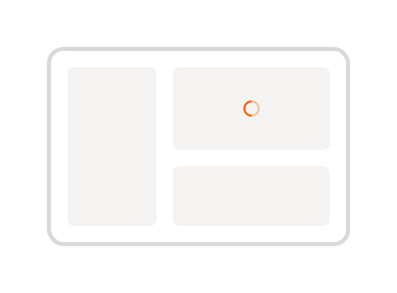
Spinners should always be centred horizontally and vertically within the viewport, container, or component they indicate is loading.
Page
The spinner should be centred in the viewport to indicate a full-page loading state.
Section
The spinner should be centred in the loading section to indicate which section is loading.
Components
The spinner should be centred within the component to indicate that an action is being processed.


Examples
LTR examples
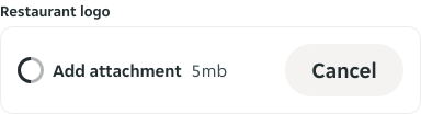
Here are some examples of spinner component in left-to-right context:
RTL examples
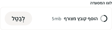
Here are some examples of spinner component in right-to-left context: