Payment Method Card

Graphic element that displays a payment method such as digital wallet, credit or debit card.

Overview

The payment method card displays the user’s payment method information.
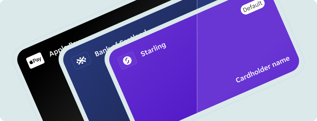
Overview of the payment method card component showing a card with an icon, payment method name, status tag, and cardholder name.

Dos and Don'ts

Do
  • Stack multiple payment method components where needed.
Don't
  • Don't override icon and background pairings. If you need a new variant please follow this process.
  • Don't resize the component.


Anatomy

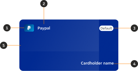
Annotated diagram of a payment method card showing its main parts: icon, payment method name, status, cardholder name, and background.
  1. Icon: Displays the icon associated with the payment method.
  2. Payment method name: Displays the name associated with the payment method.
  3. Status: Changes based on the validity or user preferences of the payment method card.
  4. Cardholder name: Displays the name issued on the card.
  5. Background: Displays the background colours associated with the payment method's brand.

Variants
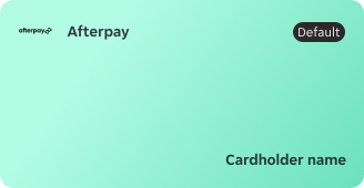
Afterpay

Payment method card showing the Afterpay variant.

Amazon Pay

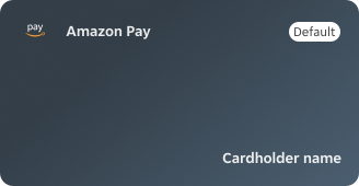
Payment method card showing the Amazon Pay variant.

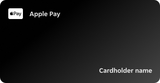
Apple Pay

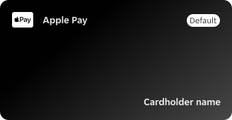
Payment method card showing the Apple Pay variant.

Bank of Ireland

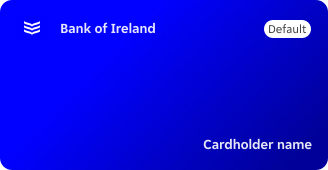
Payment method card showing the Bank of Ireland variant.

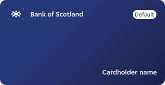
Bank of Scotland

Payment method card showing the Bank of Scotland variant.

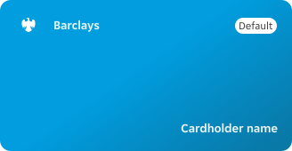
Barclays

Payment method card showing the Barclays variant.

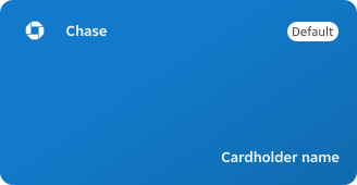
Chase

Payment method card showing the Chase variant.

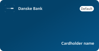
Danske Bank

Payment method card showing the Danske Bank variant.

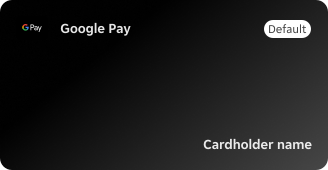
Google Pay

Payment method card showing the Google Pay variant.

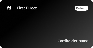
First Direct

Payment method card showing the First Direct variant.

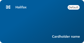
Halifax

Payment method card showing the Halifax variant.

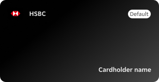
HSBC

Payment method card showing the HSBC variant.

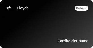
Lloyds

Payment method card showing the Lloyds variant.

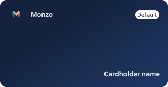
Monzo

Payment method card showing the Monzo variant.

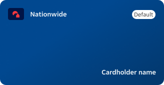
Nationwide

Payment method card showing the Nationwide variant.

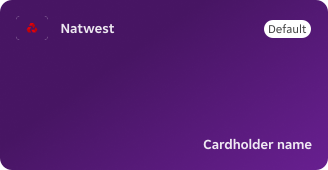
NatWest

Payment method card showing the NatWest variant.

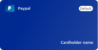
Paypal

Payment method card showing the Paypal variant.

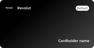
Revolut

Payment method card showing the Revolut variant.

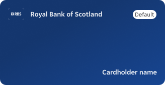
Royal Bank of Scotland

Payment method card showing the Royal Bank of Scotland variant.

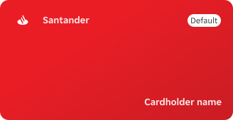
Santander

Payment method card showing the Santander variant.

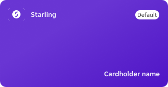
Starling

Payment method card showing the Starling variant.

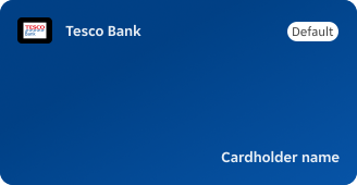
Tesco Bank

Payment method card showing the Tesco Bank variant.

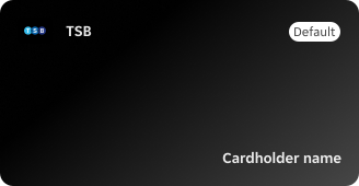
TSB

Payment method card showing the TSB variant.

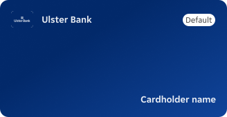
Ulster Bank

Payment method card showing the Ulster Bank variant.

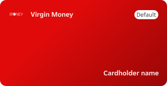
Virgin Money

Payment method card showing the Virgin Money variant.

States

Each variant of the payment method card has three states: default, non-default and expired.
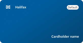
Default

The tag indicates the card is the default payment option.

Payment method card in the default state, showing a tag indicating it is the default payment option.

Non-default

The payment method is not predefined by the user.

Payment method card in the non-default state, without a default tag.

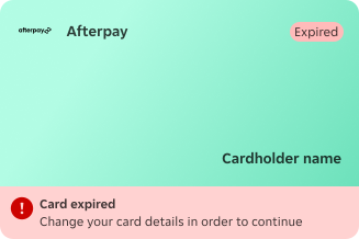
Expired

An added banner and a tag display that there is an error with the payment method.

Payment method card in the expired state, showing an error banner and tag.

Sizes

Resizing the component is not needed. The component follows the size and shape of a physical card.

Keep in mind: The size of the component can only be changed proportionally. Ideally when used in conjunction with interactions or nested within components.

Height

  • Minimum height of 170px when on default state.
  • Height increases to 218px when displaying the expired state.
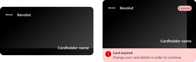
Diagram showing the payment method card height measurements for default and expired states.

Width

  • Maximum width of 328px, allowing for proportional scaling if necessary.
Recommendation: Don't resize the component if placed on a bigger screen. It should resemble the actual size of a physical card.

Narrow screens

In narrow screens the payment method card uses the original component size.
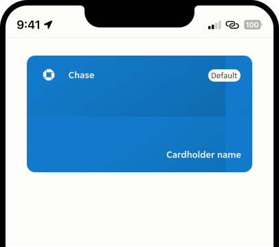
Payment method card displayed at its original size on a narrow screen.

Wide screens

In wider screens the payment method card remains the same size.
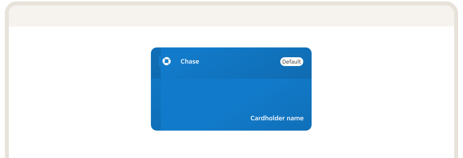
Payment method card displayed at its original size on a wide screen.

Icon size

The payment method icon follows the size and proportions of the original Icon / Payment method (32x24px) component that is nested.

Diagram showing the payment method icon size at 32x24px.

Content

The component displays highly monitored third party branding elements. These are to be updated whenever the branding guidelines of the payment service providers are updated.

Icon

Size and proportions remain unchanged from the payment method icons in our Icons library.

Background

  • Asset used for the background needs to be sourced from the pillar repository, not from the PIE repository.
  • The available background assets are to be used as reference and are not available for production.
  • Follow the guidelines to create and maintain new payment method card background assets. Contact the design system team for the link.

Cardholder name

Text string shouldn't break into 2 lines.


Overrides
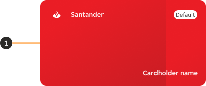
Payment method card showing the elevation override applied.
  1. Elevation: An elevation token can be added based on placement and positioning in relation to other elements.

Behaviour

Shimmer effect

The shimmer effect from the Skeleton component can be utilised as a moment of delight.
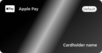
Suggestion: The animation can be triggered via interaction or based on gyroscope coordinates.
Payment method card showing the shimmer effect behaviour.

Layout

Stacking

Component can be resized proportionally only while stacking multiple cards.
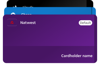
Payment method cards stacked, showing proportional resizing.

Examples

LTR

Here are some examples of Payment method card in left-to-right context.
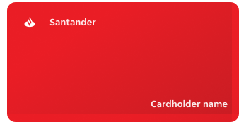
Example of payment method cards in a left-to-right layout.

RTL

In right-to-left context the payment method card component remains the same but cardholder name changes direction.
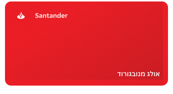
Example of payment method cards in a right-to-left layout, with cardholder name mirrored.
Back to top