- Apply focus states only to interactive UI elements.
- Use the colour and format established in our design system.
- Always test the focus order in your designs.
Focus State
Focus state is a visual indication that a UI element (such as a button, link, or form field) is currently focused or active.
What is a focus state?
It's important for users to be aware of their location as they navigate through a web page or document, regardless of whether they are using a keyboard or a mouse. To achieve this we use the focus state.
One of the most important reasons is for accessibility, as it allows users who navigate with a keyboard or assistive technology to easily identify which element they are interacting with.
- Don't apply focus states to non-interactive UI elements.
- Avoid modifying the focus state's colour and format.
- Don't overuse focus states.
How do we represent the focus state?
Although the focus state can be represented in a variety of ways, we use a visible two-colour outline (2px each) around the element being focused.
This outline is clearly visible and has enough contrast with the background colour of the element, as well as the background where the UI element is placed over.

Guidelines for usage
Here are some guidelines to consider when using the focus state in your designs:
Be consistent
Use the same visual treatment for the focus state across all UI elements. This will help users understand that the outline or border indicates a focus state, regardless of which element they are interacting with.


Use sparingly
While the focus state is important for accessibility, it can also be distracting if overused. Avoid adding a focus state to every UI element on the page and instead only apply it to the elements that require user input.
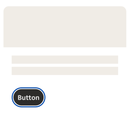
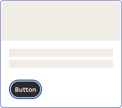
Test the focus order
Testing the focus order in a UI is important because it ensures that all users, especially those who rely on keyboard navigation or assistive technologies, can easily and efficiently navigate through the UI. The focus order determines the sequence in which UI elements receive focus when a user navigates using the keyboard or other assistive technology.
If the focus order is not tested, it can lead to accessibility issues such as users being unable to access important UI elements, the focus order being inconsistent, or unexpected behaviour when navigating with the keyboard. Testing the focus order ensures that the UI is accessible and usable for all users and can help prevent frustration or errors when navigating the UI.