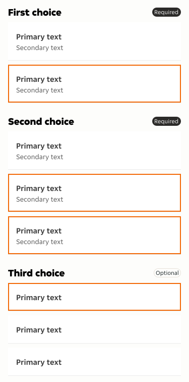
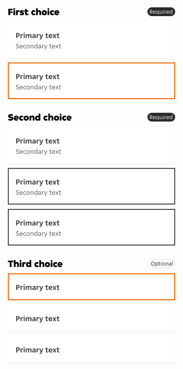
- Ensure selected elements are clearly distinct.
- Use our suggested visual cues to avoid ambiguity.
- Use our suggested visual cues to maintain consistency across designs.
Selected State
A selected state refers to the visual representation of a UI element that a user has interacted with to select, indicating it is currently active or highlighted.
Overview
Selecting a UI element is a fundamental and common interaction in many user interfaces. It allows users to identify and interact with specific items within a group.
Do's and Don'ts
- Avoid excessive visual changes to prevent clutter.
- Don't compromise the readability of text or content within the selected element.
Visual indicators
We’ve put together a list of items and visual cues which you should or could use to highlight selected boxes and cards.
Border
-
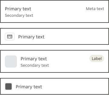
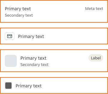
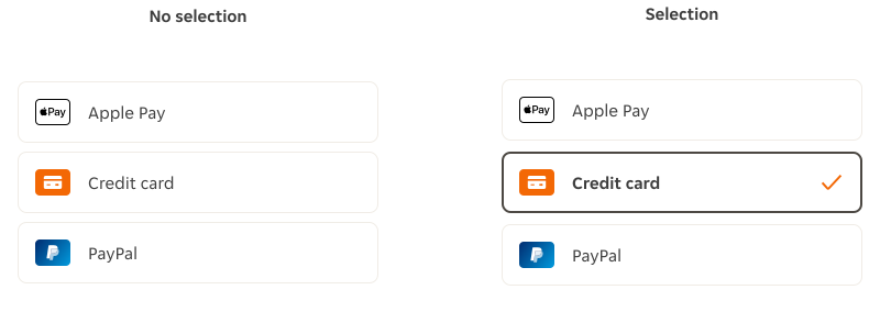
Change the border colour to $color-border-selected-brand as the default token for selected state. Use $color-border-selected as an alternative to orange.
-
Change the border weight to 2px.
Using $color-border-selected
Using $color-border-selected-brand
Iconography
-
In components using a specific placeholder slot, use the tick icon.
-
In components using placeholder slots with different size options, use a 24x24px tick icon, and set it to $color-content-brand colour.
Component variant
-
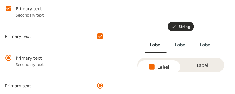
Use UI controls like radio buttons or checkboxes to indicate selections.
-
Make sure you're using the 'selected' variant of the component.
Aim for consistency
If selected state is presented across several steps of the journey use the same border for all components.