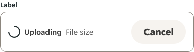
- Use a spinner whenever the anticipated wait time is between 2 and 5 seconds.
- Use when retrieving data or performing slow computations to notify the user that their request is being processed.
- On Android, the “swipe to refresh” gesture displays a circular progress indicator to indicate that the UI is being refreshed.
Spinner
A spinner is a visual element that indicates an ongoing activity or loading progress.
Dos and don'ts
- Avoid showing multiple spinners on a single page.
Anatomy

- Spinner: Visual indicator that continuously animates.
Variants
Brand

Secondary

Secondary dark

Inverse

Inverse light

Size
Outlines the spinner sizes that are available, and where they should be used across our products.
| Component | Name | Size (px) | Role examples |
|---|---|---|---|
 | XS | 16 x 16 | - |
 | S | 20 x 20 | Buttons, Chip. |
 | M | 24 x 24 | Icon Buttons, Uploader. |
 | L | 32 x 32 | - |
 | XL | 48 x 48 | Whole page. |
Placement
Spinners are positioned to indicate the process that they represent.
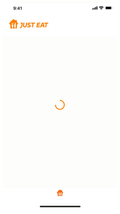
Centered
When centered on the screen, they indicate the initial loading of screen content.
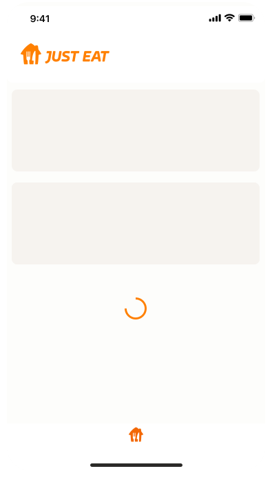
Above or below
When placed above or below existing content, they draw attention to where new content will appear.
Within a component
When placed within a component, they indicate the action is being placed after an interaction with the certain component, to express a connection between an interaction and a specific item. They are also typically used to express when an interaction, such as clicking a button again, isn’t available.


Animation
Preview the Spinner animation here.

Examples