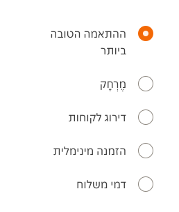
- Use popover to display lists of options.
- Ensure content is easy to scan for relevant and actionable information.
Popover
A popover is a small overlay that appears above content, offering extra information, context, or options to the user.
Dos and Don'ts
- Don't use popovers for static content, use tooltips instead.
- Don't display critical options in a popover.
Anatomy
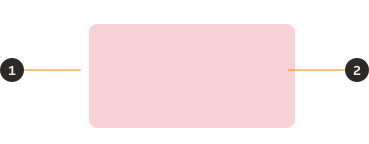
- Container: Background container that organises the information.
- Slot: Open slot for any content required.
Variants
Default

Size
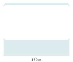
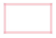
The width and height of the container is dynamic to the content with a minimum width of 160px. The container retains 8px of padding around the slot.
Content
The popover container comes with a slot, so you can add any content you like to the popover. For the internal spacing of the card container, make sure to use PIE spacing tokens. You can find more information about these tokens in the spacing documentation.
Placement
Spacing
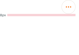
Popover should have 8px spacing between the container and the associated UI element.
Position
A popover can open at the top, bottom, left or right depending on the position of the UI trigger on the screen, but it should never be centred.
By default, the popover opens from the bottom. If the trigger appears near to the edge of the interface, the popover may open from a different position to avoid cropping, bleeding off the page or covering important information.




Behaviours
Trigger
A trigger should be an interactive UI element, such as an icon button or a button. Popovers are triggered by clicking (on desktop) or tapping (on tablet and mobile) the trigger element.
Only one popover at a time
When a new popover is triggered, the previous one is dismissed.
Interactions
Close
Popover remains persistent until the user interacts with its content, clicks/taps the trigger again, or clicks/taps outside of the popover.
Examples
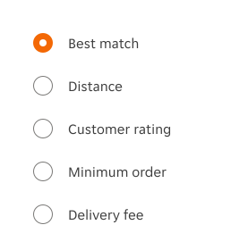
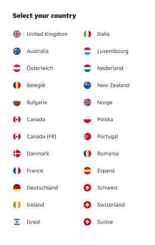
Here are some examples of the component in left-to-right context.
LTR examples
RTL examples
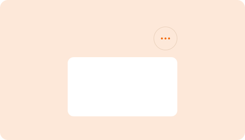
Here are some examples of the component in right-to-left context.