- Use them for iOS overflow solutions such as when you need to add more options into header content.
- Order your menus by which items are used the most frequently.
Popover
A popover is a small overlay that appears above content, offering extra information, context, or options to the user.
Overview
- Don't put too much information into a context menu. Context menus should be easy to scan.
Anatomy
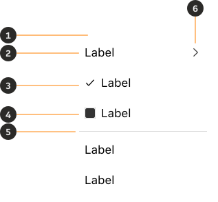
- Liquid Glass Container: Bounding box for the menu's content.
- Label: The main message or information.
- Selected (Optional): Shows selected menu items.
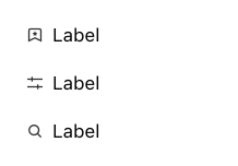
- Leading icon (Optional): Provides visual context.
- Border (Optional): Divides content.
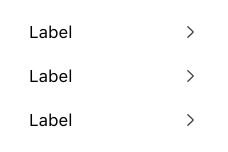
- Chevron (Optional): Shows that a menu item opens further options.
Variants
Light
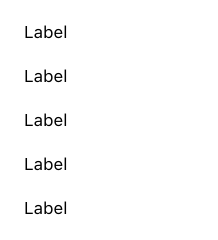
Use light theme Liquid Glass Context Menus in light theme.
Dark
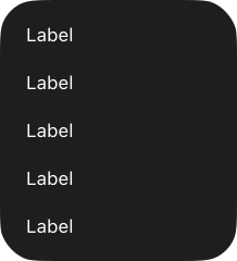
Use dark theme Liquid Glass Context Menus in dark theme.
Modifiers
Selected
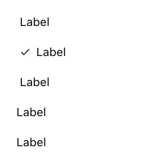
The selected modifier can be toggled on to highlight a menu item that is user selected.
Leading icon
Leading icons can be added to menu items to provide visual context and quick recognition.
Chevron
A trailing chevron shows that a menu item opens further options.
Interactions
Opening a menu
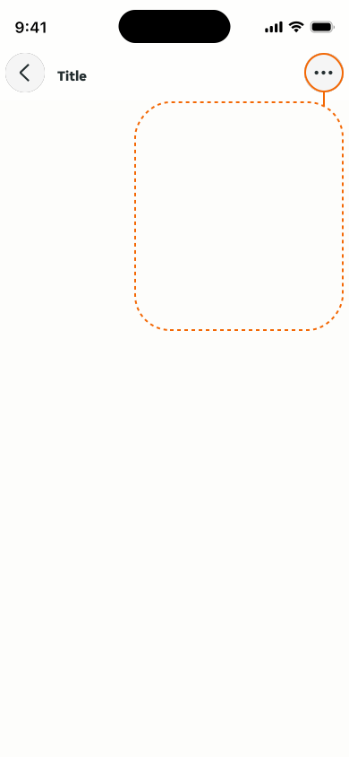
Contextual menus are always hidden, and can be revealed usually by clicking an icon button (such as an overflow menu). Context menus will open close to their point of origin.
Closing a menu
You can close a context menu by either making a selection of the menu items or by tapping outside the menu's boundaries. This provides an intuitive way to dismiss it without interacting with the menu item selection.

Content
Labels
Ensure the content follows platform specific wording.
LTR examples
Here's an example of a context menu in context.

RTL examples
Here's an example of a context menu in RTL context.