Pagination

Pagination is a navigational element that divides content into pages for improved user experience with large amounts of data.

Dos and Don'ts

Do
  • Use it to enable users to focus on a smaller section of content at once.
  • Use it for separating large amounts of content.
  • Use it to clarify that more content is available to explore.
Don't
  • Don't use it when there's only a small amount of content which fits in one single page.


Anatomy
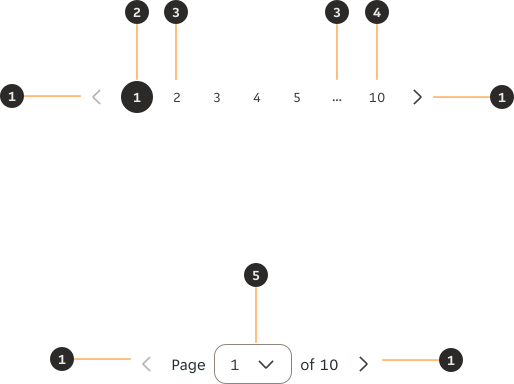
Annotated diagram of a pagination component showing its main parts: pagination control, selected page, ellipsis, page count, and selected page/dropdown control.
  1. Pagination control: Icon Button which allows the user to show the information in the previous page. Will look disabled if there is no previous page.
  2. Selected page: Indicates which page is currently being viewed.
  3. Ellipsis (Optional): Represents other pages in between to save horizontal space.
  4. Page count: Indicates how many pages there are in total.
  5. Selected page / Dropdown control: Indicates both which page is currently being viewed and allows the user to skip to any page via the dropdown control.

Variants

Default

A pagination component showing the default variant with numbered page buttons.
A pagination component showing the dropdown variant with a page selector control.

Behaviours

Default

A minimum and maximum value must always be defined. Once the value reaches either threshold, the correlating Icon Button is disabled.


Default pagination at the start of a range, with the previous page button disabled.
Default pagination in the middle of a range, with both pagination controls enabled.
Dropdown pagination at the start of a range, with the previous page button disabled.
Dropdown pagination in the middle of a range, with both pagination controls enabled.

Ellipsis

The ellipsis is used with default Pagination when the quantity of pages gets too large and overwhelming. If the total page count is over 7, and the number of hidden pages is more than 1, the ellipsis is displayed.


Default pagination without ellipsis, showing all page numbers.
Default pagination with ellipsis, condensing a large number of pages.

Interactions

The Pagination's Icon Buttons and controls are used to paginate the user across the pages. Ellipsis and disabled pagination controls aren't interactive.


Default pagination variant illustrating interactive and non-interactive elements.
Dropdown pagination variant illustrating interactive and non-interactive elements.

Alignment

Alignment is always relative to the container width instead of the entire page.
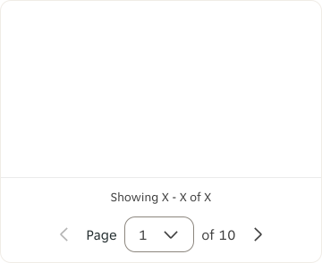
Centre

Pagination component centred within its container.

Left

Pagination component aligned to the left of its container.
Pagination component aligned to the right of its container.

Narrow

At narrow screen sizes the default variant uses dropdown controls in order to ensure content fits within the available width. This also allows users to skip to any page easily.
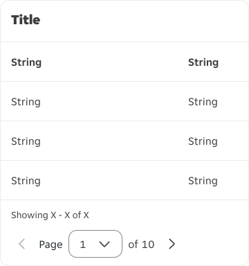
Pagination component at a narrow screen size, switching to the dropdown variant.

Interactive states

Outlines the atomic level interactive elements for the component.

Default

Unselected

Pagination controls showing the default interactive state for unselected page items.

Selected

Pagination controls showing the default interactive state for the selected page item.

Hover

Unselected

Pagination controls showing the hover interactive state for unselected page items.

Selected

Pagination controls showing the hover interactive state for the selected page item.

Active

Unselected

Pagination controls showing the active interactive state for unselected page items.

Selected

Pagination controls showing the active interactive state for the selected page item.

Focus

Unselected

Pagination controls showing the focus interactive state for unselected page items.

Selected

Pagination controls showing the focus interactive state for the selected page item.

Examples

LTR examples

Here are some examples of Pagination in LTR context.
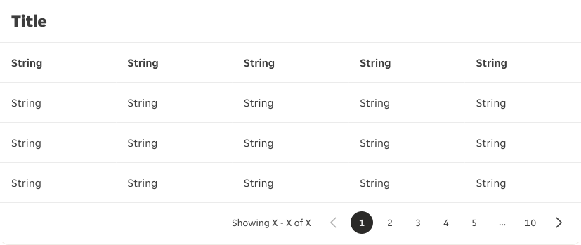
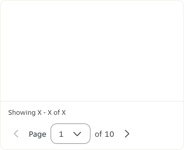
First example of pagination used in a left-to-right web context.
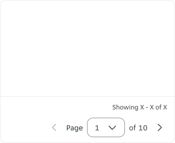
Second example of pagination used in a left-to-right web context.

RTL examples

Here are some examples of Pagination in RTL context.
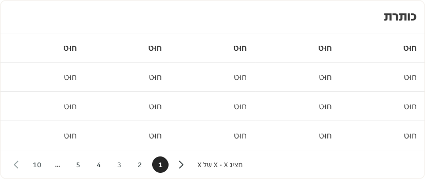
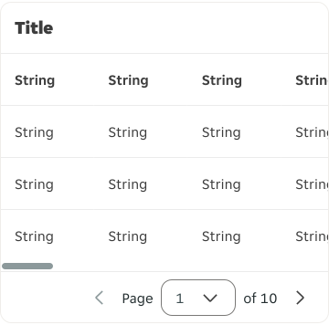
First example of pagination in a right-to-left layout, with controls and page order mirrored.
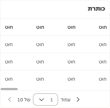
Second example of pagination in a right-to-left layout, with controls and page order mirrored.
Back to top