- Use it to enable users to focus on a smaller section of content at once.
- Use it for separating large amounts of content.
- Use it to clarify that more content is available to explore.
Pagination
Pagination is a navigational element that divides content into pages for improved user experience with large amounts of data.
Dos and Don'ts
- Don't use it when there's only a small amount of content which fits in one single page.
Anatomy
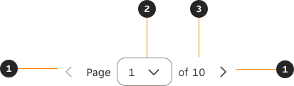
- Pagination control: Icon Button which allows the user to show the information in the previous page. Will look disabled if there is no previous page.
- Selected page / Dropdown control: Indicates both which page is currently being viewed and allows the user to skip to any page via the dropdown control.
- Page count: Indicates how many pages there are in total.
Variants
Dropdown

Behaviours
Dropdown
A minimum and maximum value must always be defined. Once the value reaches either threshold, the correlating Icon Button is disabled.



Interactions
The Pagination's Icon Buttons and controls are used to paginate the user across the pages. Disabled pagination controls aren't interactive.

Alignment
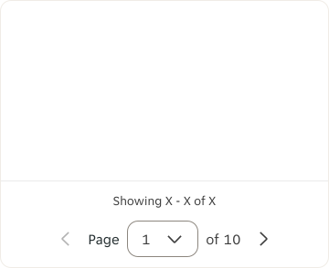
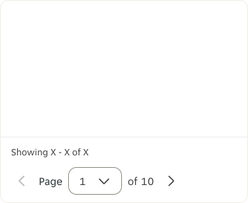
Alignment is always relative to the container width instead of the entire page.
Centre
Left
Right
Examples
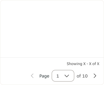
LTR examples
Here is an example of the Pagination in LTR context.
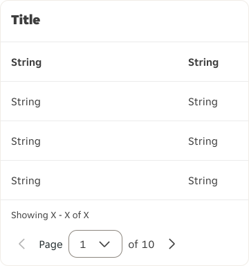
RTL examples
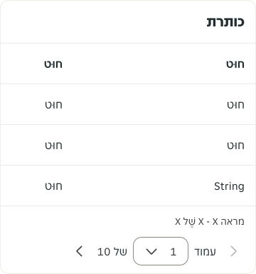
Here is an example of the Pagination in RTL context.