- Use a card when the entire container is clickable.
- Use a card to display content and actions on a single topic.
- Card contents should be easy to scan for relevant and actionable information.
Card
A card is a container element that visually represents a distinct unit of content within a user interface.
Dos and don'ts
- Don’t use a card if the container doesn’t need to be clickable, find an alternative component.
- Don't use a card for selection control, use radio groups, checkboxes or list items instead.
Anatomy

- Container: Background container that organises the information.
Variants


Content
Slot available
The card container comes with a slot, so you can add any content you like to the card. For the internal spacing of the card container, make sure to use PIE spacing tokens. You can find more information about these tokens in the spacing documentation.


Overrides
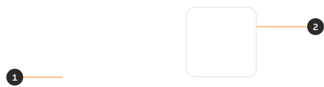
- Elevation: It can be removed or replaced with another elevation token as needed.
- Border colour: It can be replaced with another border colour token as needed. Ensure the chosen token provides sufficient contrast against the background on which the card is placed.
Behaviour
Cards can be used as draggable items. When the card is grabbed, the pointer changes and the drag state is activated.

Interactions
Drag on mobile
Mobile devices don't have a hover cursor, so dragging actions might not be the most intuitive choice on mobile screens. If you're using a draggable card in your mobile designs, make sure to provide clear context and guidance to the user.
Use when the entire card is clickable
Use cards only when the entire container is clickable and triggers an action, such as opening details or navigating to another page. If only elements within the card (such as buttons, icon buttons, or avatars) are interactive, use a standard container or another suitable component instead.
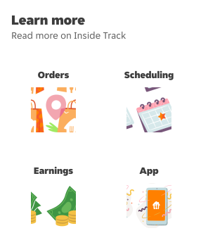
Use a card when clicking anywhere on it navigates the user to another page.
Don’t use a card when only the button inside the card is clickable and the rest of the card is not interactive.
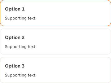
Do not use cards for selection
Cards are designed to present content and actions, while selection components are designed to capture a user's choice. Using cards for selection can make the interaction less clear and introduce unnecessary complexity.
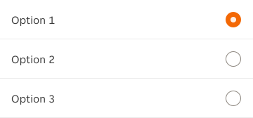
Use list items with form selection variants and clear selected/unselected states.
Don’t use cards to present selectable options.
Interactive states


Examples
LTR examples
Here is an example of a Card in a left-to-right context:

RTL example
Here is an example of a Card in a right-to-left context:
