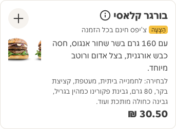
- Use a card to display content and actions on a single topic.
- Card contents should be easy to scan for relevant and actionable information.
Card
A card is a container element that visually represents a distinct unit of content within a user interface.
Dos and don'ts
- Don't use a card if the container doesn't need to be clickable, find an alternative component.
Anatomy

- Container: Background container that organises the information.
Variants
Default

Outline

Inverse

Inverse outline

Content
The card container comes with a slot, so you can add any content you like to the card. For the internal spacing of the card container, make sure to use PIE spacing tokens. You can find more information about these tokens in the spacing documentation.

Interactive states



Examples
Outlines the atomic level interactive elements for the component.
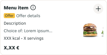
LTR examples
Here is an example of a Card in a left-to-right context:
RTL example
Here is an example of a Card in a right-to-left context: