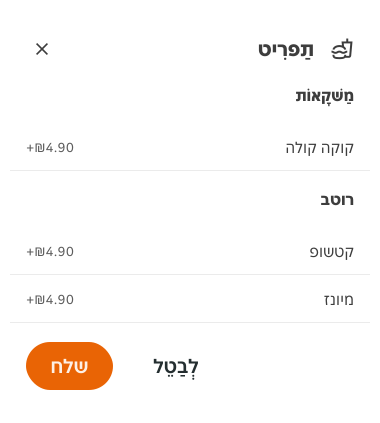
- Use bottom sheets when you need to display additional information, controls or functionalities related to the underlying content.
Bottom Sheet
A bottom sheet is a surface attached to the bottom of the screen that displays additional information or actions while keeping the main content visible.
Dos and don'ts
- Don't use bottom sheets in wide screens (over 768px wide). Use a modal instead.
Anatomy
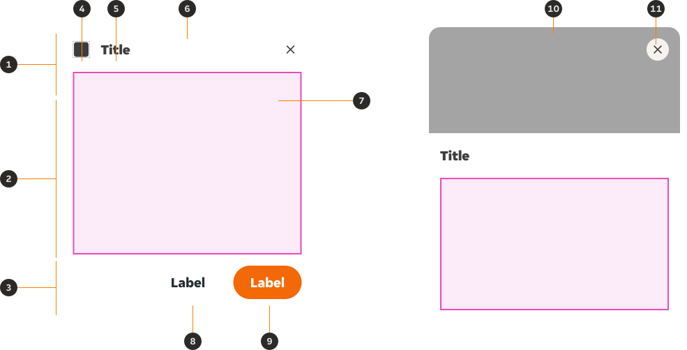
- Header: Area where the title of the bottom sheet is displayed along with its control method.
- Content: Flexible area which can contain a wide range of contents and layouts.
- Footer (optional): Contains the different actions you can perform with this bottom sheet.
- Icon (optional): Visually highlights the nature of the contents in the bottom sheet.
- Title (optional): Sums up the contents of the bottom sheet in one category.
- Pull tab (optional): Allows the user to hide the bottom sheet.
- Slot (optional): Nested slot which can be replaced by custom content.
- Primary CTA (optional): Allows the user to perform an action.
- Secondary CTA (optional): Allows the user to perform an action.
- Image/Illustration (optional): Used to display an image or illustration as the head of the bottom sheet.
- Close button (optional): Allows the user to close the bottom sheet.
Variants
Variants are just indicative templates of the type of content a bottom sheet can hold. For custom bottom sheets check the 'Custom bottom sheets' section.
Default
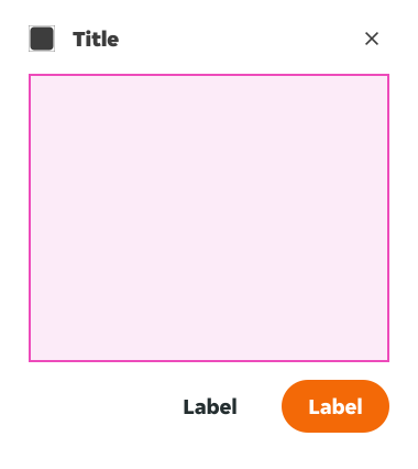
This is the default variant of the Bottom Sheet, which features a Slot which can be replaced by a local component containing the Bottom Sheet's contents.
Modifiers
Variants are just indicative templates of the type of content a bottom sheet can hold. For custom bottom sheets check the 'Custom bottom sheets' section.
.bottom_sheet-header and .bottom_sheet-footer components, as these are nested components within the main Bottom Sheet component that need to be controlled globally. If you need to customise these, please get in touch with a member of the PIE Design System team. General modifiers
Footer toggle
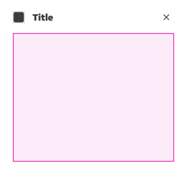
The footer can be toggled off for instances where there isn't a need for button actions.
Header specific modifiers
Controls
Controls define how the user can interact with the bottom sheet itself. There are three control variants available: Close, Pull tab or None.
Close
The user can close the bottom sheet.
Pull tab
The user can hide the bottom sheet.
None
The user can't close or hide the bottom sheet.
Contents
Indicates the type of content displayed in the header area. There are four variants:
Default
Text only header, which can include a title, an icon and a close/pull tab control.
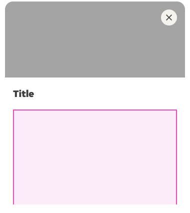
Image
This header variation can be used to display an image.
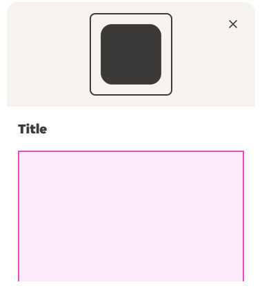
Small illustration
This header variation can be used to display small illustrations only. They display at 120x120dp.
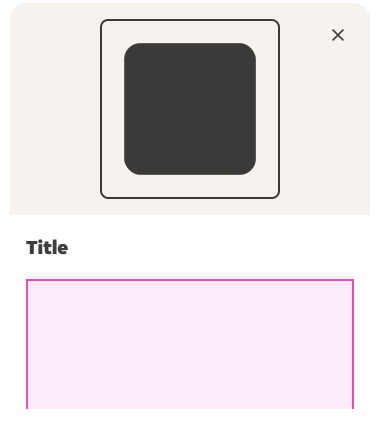
Large illustration
This header variation can be used to display large illustrations only. They display at 180x180dp.
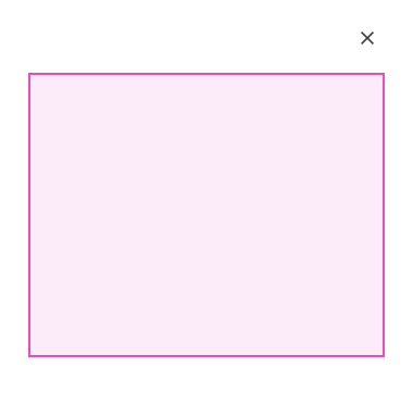
Empty
This instance will only show the selected control, removing any title, icon, image or illustration.
Title
There are several modifiers which have an effect on the way the title is displayed:
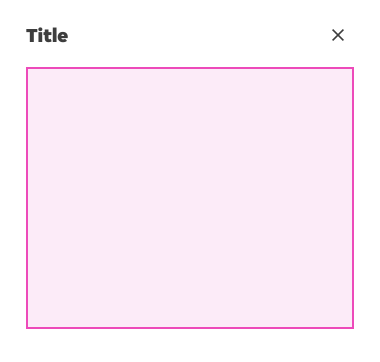
Title
This instance only shows the title.
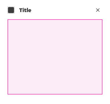
Title + Icon
This instance shows the title paired with an icon to provide more context and visual flair.
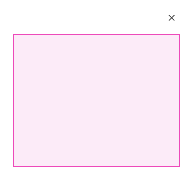
None
This modification hides the title. It should be used only when the title is not necessary.
Footer specific modifiers
Footer actions
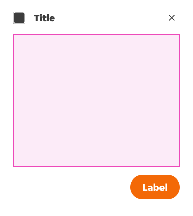
Bottom sheets will often include actions that can be performed by the user to resolve, dismiss or acknowledge the information presented in the bottom sheet. However, these actions should be kept to a minimum. We offer the following two variants:
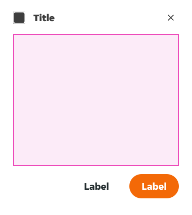
Two actions
Use it when you need to offer both a primary and secondary action. Usually these represent the main action of the Bottom Sheet (e.g. 'Acknowledge') and an alternative action (e.g. 'Dismiss').
One action
Use it when you only have one action within your Bottom Sheet.
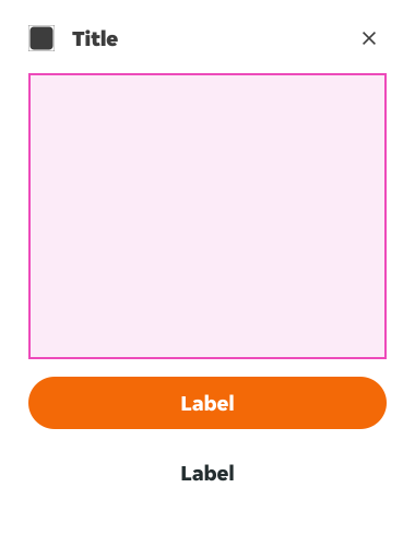
Full width buttons
Used for an alternative layout, mainly when button labels are too long.
Fixed elements
Sometimes the content inside our Bottom Sheets will be longer than the space available in our viewport. In these instances content might have to be scrolled so it can be read entirely by the user. The following section outlines the behaviours of the Bottom Sheet's header and footer when there is an overflow of content.
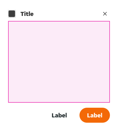
Scrolled header
In Bottom Sheets where content needs to be scrolled, the header should lay on top of the scrolled content. To visually indicate this, an elevation token ($elevation-04) has been applied to the 'Scrolled' variant of this nested component.
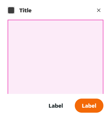
Fixed footer
Used when the content inside the bottom sheet is longer than the total height of the screen, but the actions that can be performed in the Bottom Sheet need to be visible at all times. To visually indicate this, an elevation token ($elevation-05) has been applied to the 'Fixed' variant of this nested component.
Content
- A bottom sheet causes all content and UI elements behind it to display a scrim. Tapping the scrim dismisses both the bottom sheet and scrim from view.
- The contents of the bottom sheet can be customised by using the Figma slot.
Overrides
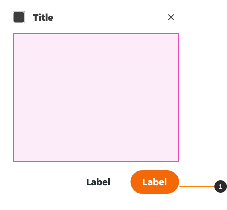
- Buttons: The Button's size can be decreased, and their variant can be changed. But all changes must adhere to the button pair guidelines if they are kept as a pair, including the size of both buttons remaining consistent.
Overflow
To provide access to its top actions, the initial vertical position of bottom sheets should be capped at 50% of the screen height. Bottom sheets whose contents exceed 50% of the screen height can then be pulled up across the full screen, scrolling internally to access their remaining items.
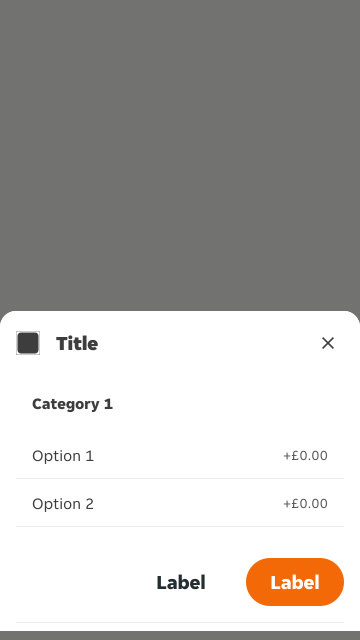
Content from a bottom sheet that initially appears below the screen edge becomes visible when you drag the sheet into view.
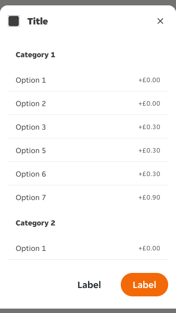
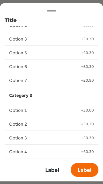
Once the bottom sheet has been scrolled up and the header has reached the top of the screen, the header will become fixed to the top so that Bottom Sheets can continue to be closed comfortably.
RTL Example
Here are some examples of Bottom Sheet in RTL context: