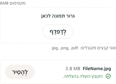
- Use Assistive Text and Label Details for additional info like file size and file format .
Uploader
An uploader is an interactive element that allows users to select and upload files from their local devices to a platform.
Dos and Don'ts
Anatomy
Uploader

- Form label: The Form Label provides necessary content / information to a field.
- String: Informational content like file name.
- Assistive Text (Optional): Assistive text to provide additional instructional information like file format.
- Button / Icon button: Opens OS file browser.
- Assistive Text: The Assistive Text provides additional instructional information like maximum file size.
- String: Text label informing the user about option/action like file size.
Uploader - Drag and drop
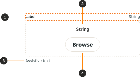
- Form label: The Form Label provides necessary content / information to a field.
- String: Informational content like file name.
- Assistive Text (Optional): Assistive text to provide additional instructional information like file format.
- Button / Icon button: Opens OS file browser.
Variants
Uploader
Default
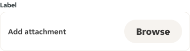
Uploader - Drag and drop
Default

Modifiers
Uploader
Label
Label is optional for "Uploading", "Success" and "Error" states.
Preview
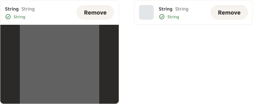
An optional preview is displayed once the file has been successfully uploaded. This may appear either within a preview container or as a thumbnail.
Preview error
If an image fails to upload, a thumbnail with a placeholder (fallback image) may be displayed in the error state.

Actions
Uploader actions can be presented as buttons or icon buttons. The chosen style should remain consistent throughout the design.

Uploader - Drag and drop
Label
Optional label can be applied to the drag and drop.

Content
Uploader
Label
Strings in uploader: All uploader text is predefined and not customisable.
Action label: Update action labels to suit the context if the default text does not meet your needs.
Overrides
Uploader
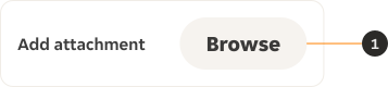
- Button: The Button / Icon button sizes can be decreased from Size medium to Size small.
Behaviour
Uploader
Single Upload
Default
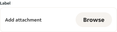
The "Browse" Button opens the OS browser for user to select a file.
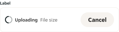
Uploading
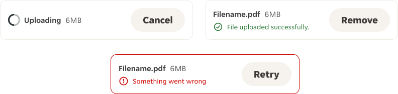
Once a file is selected, the uploader changes to the "Uploading" state. If you click the "Cancel" Button, the uploading stops and the Uploader changes back to the "Default" state.

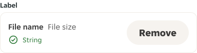
Success
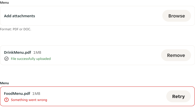
Once a file is successfully uploaded, if you click the "Remove" Button, the upload is removed and the Uploader changes back to the "Default" state.

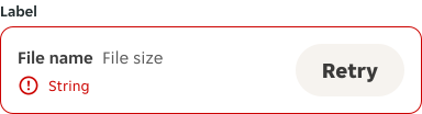
Error
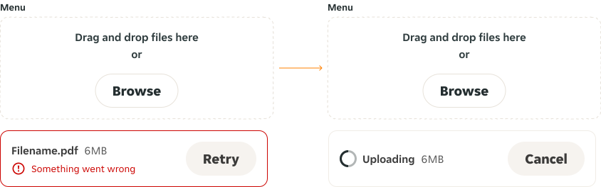
If a file can't be uploaded, the Uploader changes to the "Error" state. If you click the "Retry" Button, the uploading restarts and the uploader changes to the "Uploading" state.

Multi Upload
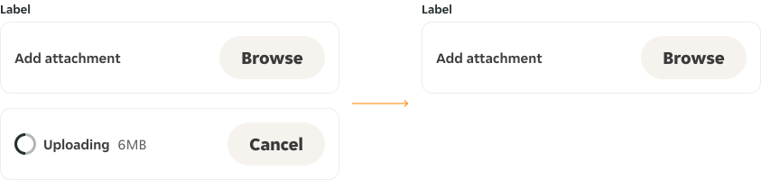
Uploading
Once a file is selected, an "Uploading" state of the Uploader appears underneath the uploader. If you click the "Cancel" Button, the uploading stops and the second Uploader disappears.
Success
Once a file is successfully uploaded, if you click the "Remove" Button, the upload is removed and the second uploader disappears.
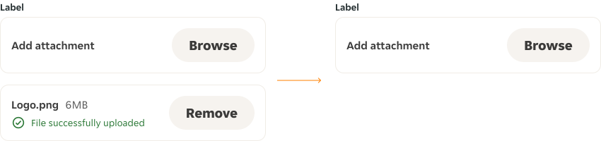
Error
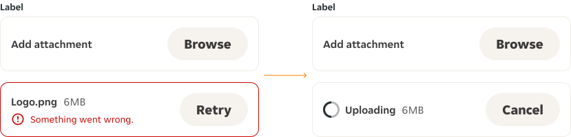
If the file can't be uploaded, the second uploader changes to the "Error" state. If you click the "Retry" Button, the uploading restarts and the second uploader changes to the "Uploading" state.
Uploader - Drag and drop
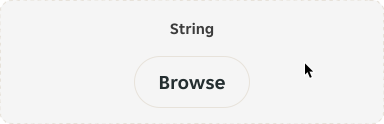
Default
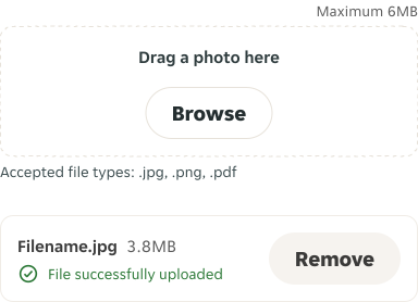
Users can either drag and drop file or click on “Browse” button that opens the OS browser for user to select a file.

Uploading
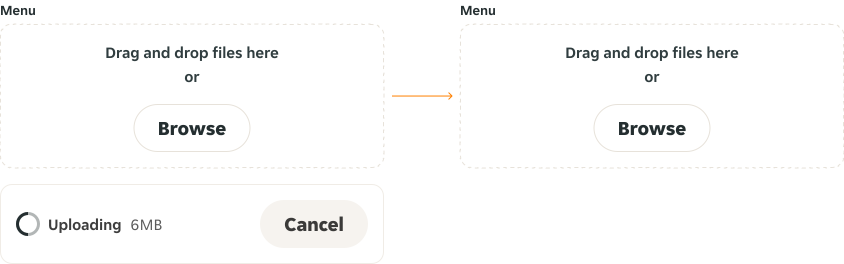
Once a file is selected, an “Uploading” state of the Uploader appears underneath the Drag and Drop. If you click the “Cancel” Button, the uploading is cancelled and the Uploader element disappears.
Success
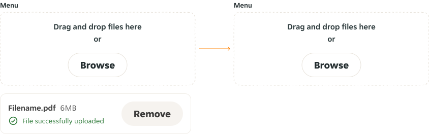
Once a file is selected, an “Uploading” state of the Uploader appears underneath the Drag and Drop. Once uploaded, if you click on “Remove” Button, the upload is removed and the Uploader element disappears.
Error
If a file can't be uploaded, the Uploader changes to the "Error" state. If you click the "Retry" Button, the uploading restarts and the uploader changes to the "Uploading" state.
Interactive states
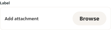
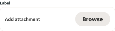
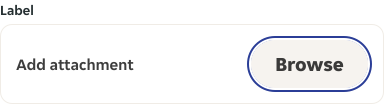
Outlines the atomic level interactive elements for the component.
Uploader
Uploader - Drag and drop


LTR examples
Here are some examples of Uploader in LTR context.
Uploader
Uploader - Drag and drop
RTL examples
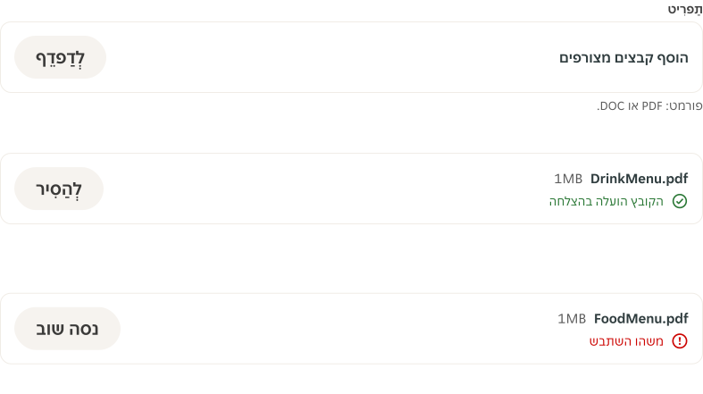
Here are some examples of Uploader in RTL context.
Uploader
Uploader - Drag and drop