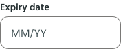
Text Input
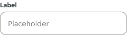
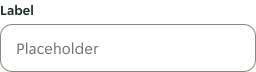
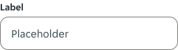
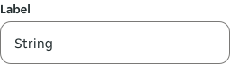
A text input is an interactive element that allows users to enter and edit text within a user interface.
Anatomy
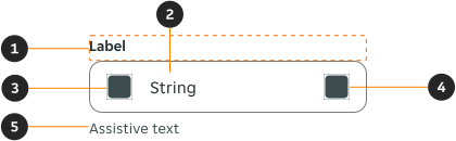
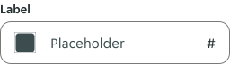
- Form label (optional): The form label provides necessary content / information to a form.
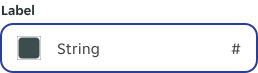
- String: Placeholder or user inputted value.
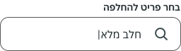
- Leading content (optional): An icon, text, or symbol that is used to visually support the input. It is displayed before the input's value.
- Trailing content (optional): An icon, text, or symbol that is used to visually support the input. It is displayed after the input's value.
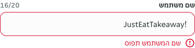
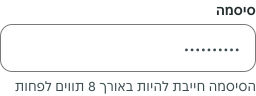
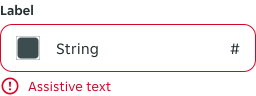
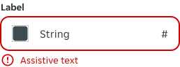
- Assistive text (optional): The assistive text provides additional instructional information / error / success messaging.
Variants
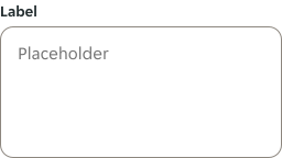
Textarea
Modifiers
Leading and trailing content
An icon, text, or symbol can be added to visually support the input. Leading and trailing content can be combined depending on the use-case.
Icon
Use a leading icon for non-interactive icons that visually support the text input.
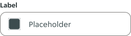
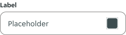
Use a trailing icon for interactive icons within the text input.
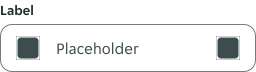
Use both leading and trailing icons when non-interactive and interactive icons are required.
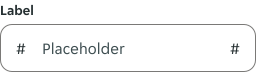
Alphanumeric
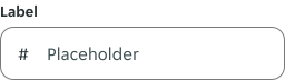
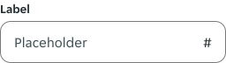
Use when text input requires clarification of the input format, such as a symbol or unit of measure. It is recommended to use less than 4 characters in leading or trailing content.
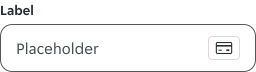
Payment method
Payment method is only available in trailing content. Use when a text input requires a card number to be entered, and reflect the card entered by the user.
Type
Label
Labels can be removed in certain use cases, but it is advised against due to accessibility reasons. In instances where it needs to be removed, it is recommended that a ‘hidden label’ is embedded into the code for screen readers to announce.

Sizes
Height
Use a consistent text input height when it is being used alongside other form components on the same page.
Width
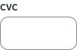
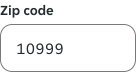
Use the field width to set the users' expectations, this can help us communicate how much input is required. For example, if a field should only have 5 characters, a full width field would not be suitable. In forms, aim to standardise widths for text inputs to enhance readability for users.
Content
Placeholder
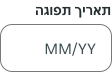
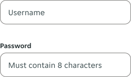
Placeholder text is optional, it should not contain important information, and should only be displayed if it is useful to the user.
- Use clear placeholder text for the text input trigger so that users understand its purpose, e.g. example of the input data.
- Placeholder text should not be used as a label
- For additional information or instruction, use assistive text instead.
Input types
Alphanumeric
Both letters, numbers and certain special characters are allowed, for the majority of use-cases this will be used.
Layout
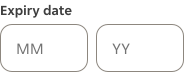
Inputs can be placed side by side, if they are required under the umbrella of one label.
Overflow
Single line
If the string exceeds its available visible bound, the content overflows to the left.

Multi line
Multi line text input automatically resizes based on the amount of content the user inputs. A max height of the text input is defined per user case.

Textarea
Textarea text input automatically resizes based on the amount of content the user inputs. A max height of the text input is defined per user case.

Behaviour
Assistive text
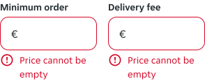
If space is limited, long assistive text may wrap to multiple lines, especially if there are multiple text inputs sitting side by side. Every text input should have its own assistive text, even if the content is identical.
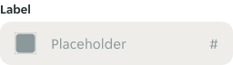
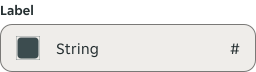
Interactive states
Outlines the atomic level interactive elements for the component.
Examples
LTR examples
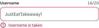
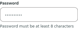
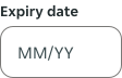
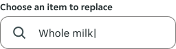
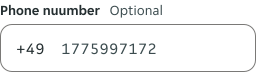
Here are some examples of text inputs in a left-to-right context:
RTL examples
Here are some examples of text inputs in a right-to-left context: