- Use tabs to group related information into different categories, helping to reduce cognitive load.
- Use when there are two or more subsections of content.
Tabs
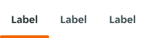
Tabs are interactive elements that organise content into separate sections or views.
Dos and Don'ts
- Tabs should never be used for primary navigation. If tabs become too complex, consider using a standard navigation pattern.
- Tabs should not be used if the user is comparing information in two groups, as this would result in the user having to click back and forth to complete a task.
Anatomy
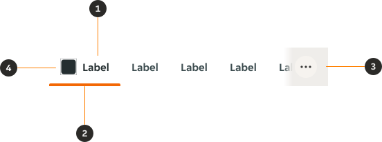
- Label: Informs the user the type of content contained within the Tab.
- Indicator: Highlights which Tab is currently selected.
- Expand (Optional): Icon button for an expanded view on narrow screens — opens a Bottom Sheet.
- Icon (Optional): Non-interactive icon that can be used to visually support the label.
Variants
Default
Modifiers
Colour
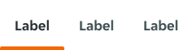
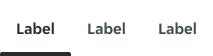
By default, the $interactive-brand is used for the Tabs, but an optional $interactive-primary variant is available for use depending on the use-case.
Icon
Icons can be used to visually support the Tab's label.

Content
Labels
- Use short tab labels that are clear and specific. Labels should be one to two words, as these are easier to scan.
- Text labels should clearly communicate the view users will see and the content contained in the view.
Behaviour
The default view is that one tab is preselected and is usually the first tab. Only one tab can be selected at a time. When a user chooses a new item, the previous tab is automatically deselected. If a user navigates away from a tab, a user should return to the last tab selected.
Overflow
Scrolling
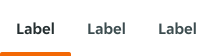
When the number of Tabs exceeds the available horizontal container, the Tabs become scrollable. This functionality is available across both wide and narrow screen sizes.


Expand
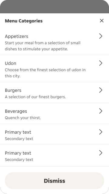
On narrow screen sizes, the option to use an Icon Button to open all Tab options within a Bottom Sheet is available if there are a large quantity of Tabs. The Icon Button is always pinned to the right of the screen. The gradient attached to the Icon Button uses its token from the container background the Tabs are sitting on.

Narrow
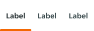
On narrow screens, the spacing of the component is updated to maximise space.
States
The Tabs allows for two states: unselected and selected.

Interactive states
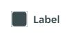
Outlines the atomic level interactive elements for the component.
LTR examples
Here are some examples of Tabs in LTR context.


RTL examples
Here are some examples of Tabs in RTL context.

