- Use switches to trigger actions that have an immediate effect, such as turning dark mode on and off.
Switch
A switch is an interactive element that allows users to switch between two states or options with a single action.
Dos and Don'ts
- Don't use a switch to trigger actions that don't have immediate effect. In that scenario use a checkbox instead.
Anatomy
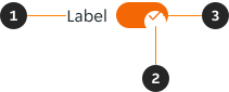
- Label (Optional): Maximum of one label. Provides necessary context to a form.
- Handle: Positioned to the right when the switch is turned on, and to the left when turned off.
- Check icon: Provides additional feedback when the switch is turned on.
Modifiers
Labels
Labels can be removed in certain use cases, but is advised against due to accessibility reasons. In instances where there is no label, it is recommended that a 'hidden label' is embedded into the code for screen readers to announce.
Switches can have their label placed to the left or the right of the switch.


States
The switch has two states available, unselected and selected.
LTR


RTL


Content
Labels
- Keep labels short so forms are easy to read and scan.
- Use sentence case.
Interactive states
Outlines the atomic level interactive elements for the component.





Examples
Outlines the atomic level interactive elements for the component.
LTR examples
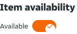
Here are some examples of switches in left-to-right context:

RTL examples
Here are some examples of switches in right to left context: