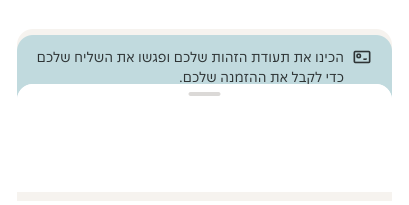
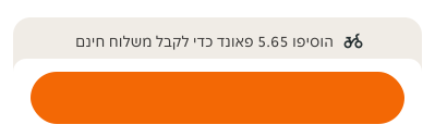
- Pair it with a container. For example Bottom sheet or Card.
- Use it for additional information that is contextual and related to the component attached to it.
- Use it for app designs only.
Stacked Notification
Non-interactive element that provides additional information related to the container it is attached to.
Dos and Don'ts
- Don't display information that requires more than 3 lines of text.
- Don't add interactive icons or CTAs.
- Don't use more than one stacked notification per element.
Anatomy
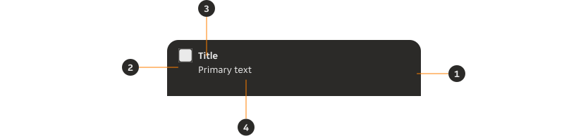
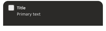
- Container: Sits behind the container it is always attached to.
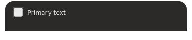
- Leading icon (optional): Non-interactive icon that can be used to visually support the primary text.
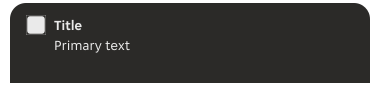
- Title (optional): Gives the users an overview of the content and contained within one line.
- Primary text: Provides additional detail.
Variants
Default
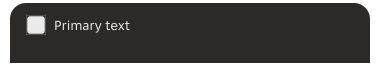
Modifiers
Title
The title can be removed where it is not necessary and it truncates text after 1 line.
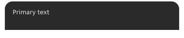
Leading icon
Leading icons can be removed for all variants if not required.
Emphasis
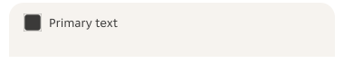
Depending on the level of visual prominence you want to give to the stacked notification you can choose between strong or subtle emphasis.
Colours
Select from a range of colour options across the two levels of emphasis.
Neutral

Positive

Warning

Info

03 Cupcake

04 Berry

06 Aubergine

08 Latte

Alignment
Default
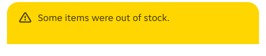
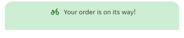
Centre aligned
Sizes
Width
Fluid to container
The width should take 100% of the container the stacked notification is placed within.
Content
Title
- The title should be short and descriptive; explain why the stacked notification is being displayed.
- If the primary text supplies all the information then using the title is optional.
Primary text
- Be concise and avoid repeating or paraphrasing the content of the title.
- Limit content to one or two lines of text when paired with a title.
Leading icon
- Use iconography related to the context and content.
Overflow
Default aligned and centre aligned variants follow different rules of text truncation and text line limit.
Default aligned
If the content exceeds the available width, the title and primary text wrap to a new line.

Centre aligned
The amount of text can be as long as the width of the stacked notification. It won't truncate or do a line break.

Layout
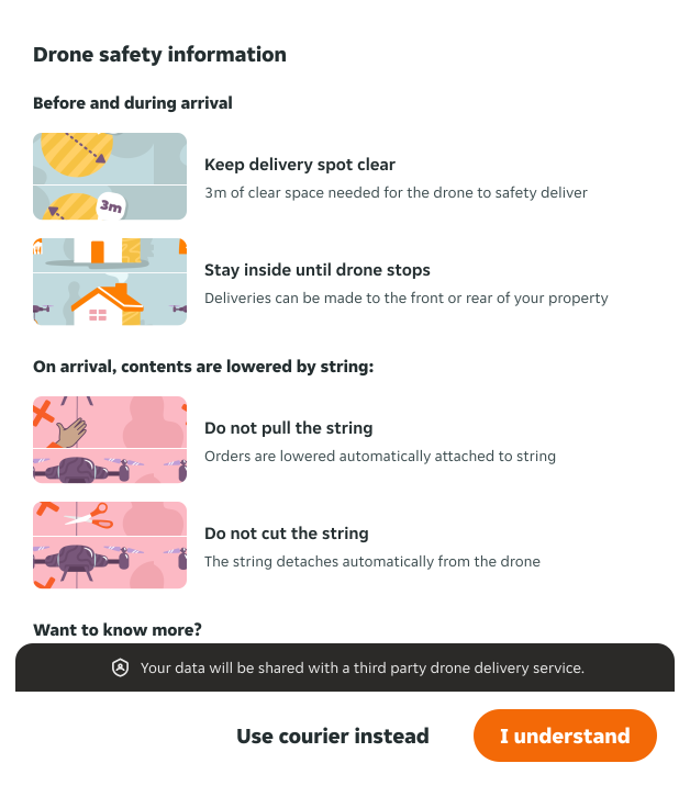
The stacked notification is always attached to a container. Depending on the type of container it will sit partially behind a container.
Rounded corners container
The stacked notification will need an overlap with the container so the corners are not left empty.
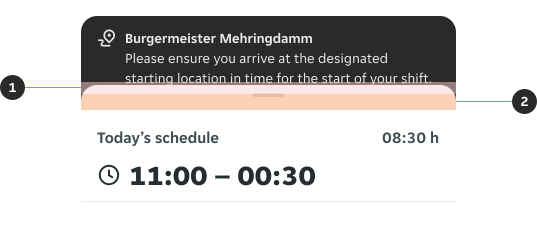
- Primary text bottom margin: Allow for a 12px bottom margin between the bottom of the text and the top of the container.
- Container overlap: Give at least 16px of overlap so the colour of the stacked notification shows around the rounded corners of the container.
Default corners container
The margin from the text is the only consideration needed for placement.
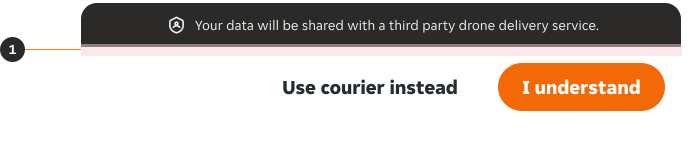
- Primary text bottom margin: Allow for a 12px bottom margin between the bottom of the text and the top of the container.
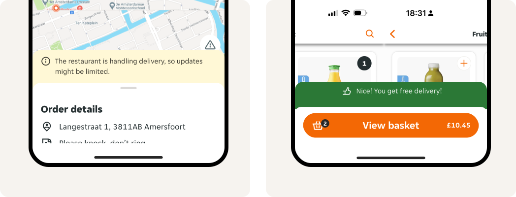
Placement
Always place it attached to the top of the element you need to expand context and information on.
Behaviour
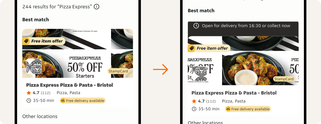
Pop up
The stacked notification slides from under the container it is attached to. It doesn't affect the size or placement of the container.
Overrides
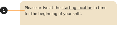
- Primary text: The supporting text can include a link, when the string is a complete sentence or more.
Examples
LTR example
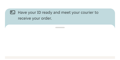
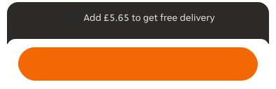
Here are some examples of a stacked notification in LTR context.
RTL example
Here are some examples of a stacked notification in RTL context.