- Use as a tool for users to compare others' opinions.
Rating
A rating is an informative element used to collect or display user ratings or feedback.
Dos and Don'ts
- Don't customise the amount of stars. Ratings should always have five available stars.
Anatomy
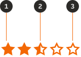
- Star: Filled.
- Star: Partially filled and only available in the static variant.
- Star: Empty.
Variants
Interactive
Used to collect the user's satisfaction regarding a product, service or item.

Static
Used to display the average rating of user's reviews.

Sizes
| Name | Component | Size | Notes |
|---|---|---|---|
| XX Large |  | 56px | Recommended to be used to be interactive. |
| X Large |  | 40px | Recommended to be used to be interactive. |
| Large |  | 32px | Recommended to be used to be interactive. |
| Medium |  | 24px | Recommended to be used as a static display. |
| Small |  | 20px | Recommended to be used as a static display. |
| X Small |  | 16px | Recommended to be used as a static display. |
Interactive states
Outlines the atomic level interactive elements for the component.
Default

Hover

Selected

Examples
LTR example
Here are some examples of the Rating component in the LTR context.



RTL example
Here are some examples of the Rating component in the RTL context.