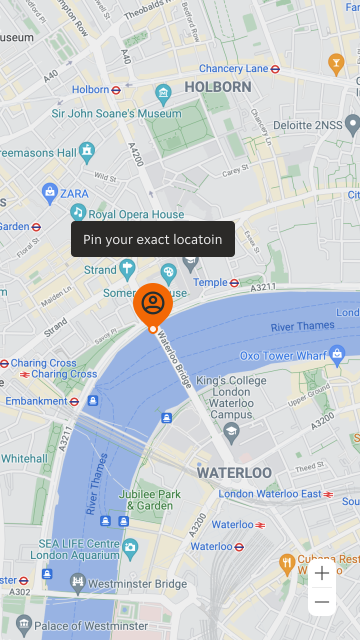
- Keep tooltip labels short and succinct.
- Always use the map pin to show singular points on a map.
Map Pin
A map pin is a visual representation used to mark a specific location or point of interest on a map.
Dos and Don'ts
- Do not use anywhere other than within a map.
- Don't display multiple tooltips at the same time on one map.
Anatomy
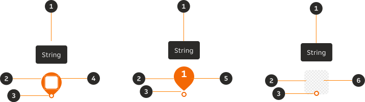
- Tooltip (Optional): Provides succinctly written context.
- Pin: Contains the icon or text information.
- Map point (Optional): Marks a point on the map with higher prominence.
- Icon: Provides quickly recognised context.
- Text: Provides quickly recognised context.
- Thumbnail: Provides quickly recognised logos.
Variants
Icon
Can be used to mark points of interest on a map with visual or symbolic context.

Text
Text can be used to mark order of stops on a map with either numbers or letters depending on pillar alignment. It is recommended that no more than two characters should be used in this component.

Thumbnail
Images can be added in the thumbnail to display partner logos. Check out the thumbnail documentation.

Modifiers
Colour
Different colour variations can be used to visually identify different points on a map, which can be designated within individual pillars.
Primary

Inverse light
The inverse map pin can provide a greater contrast against different map views, such as satellite.

01 Orange

06 Aubergine

Interaction
Interactive
A map pin should be interactive when it serves a specific purpose or action within the user interface.
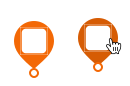
Non-interactive
Use the map pin in a static form if you want the pin to retain its original appearance without any interactive features tied with the content or context.

Tooltip position
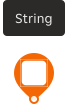
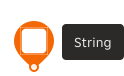
Three tooltip positions are available within the map pin component; left, top and right. The tooltip can be removed if supporting body copy isn't required.
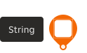
Map point
The map point should be used consistently across use-cases or pillars. The recommendation is for the map point to be used for low and high priority use-cases.
Low priority
Used to mark individual points on a map that aren't a high priority or interest to the user.

High priority
Used to mark individual points on a map that are of high priority or interest to the user, such as their location, the courier or marking a delivery A to B.

Content
Text
A maximum of two characters are permitted within the map pin, allowing pillars to add a '+' to show added stops.

Icon
The icon should visually provide context to the map pin location or stop.

Thumbnail
The image should be the logo of the partner.

Overrides
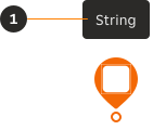
- String: The tooltip string can include bold type, when the string is a complete sentence or more.
Overflow
Tooltip
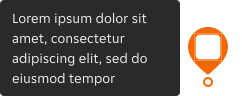
If the content exceeds the maximum width of 180px, the copy will wrap onto a new line. However it is recommended that the body copy doesn't exceed two lines.
Text
Map pin text will allow no more than two characters before truncating.

Interactive states


Examples
LTR examples
Here are some examples of map pin in left-to-right context.