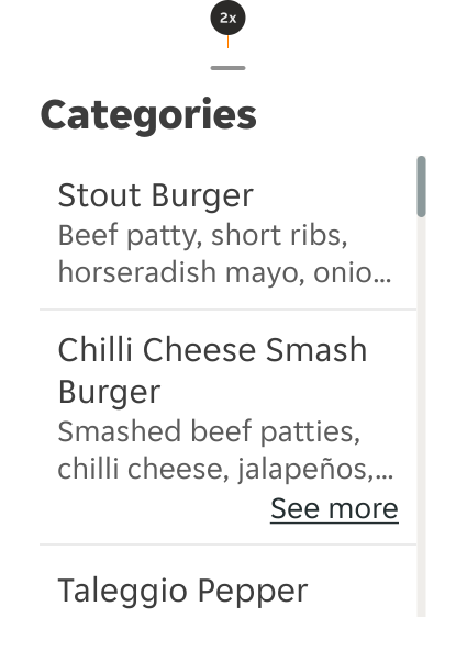
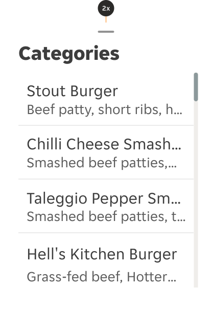
- Aim to keep the primary text to a single line without wrapping, and the secondary text to two lines if possible.
- Use list items to logically group items that follow the same content structure.
List Item
A list item is a single element in a list that displays specific information in an organised manner.
Dos and Don'ts
- Consider a different component or clarify the design if you require lots of text.
- Do not use if the list content needs to be nested more than one level deep and becomes overly complex and lengthy.
Anatomy
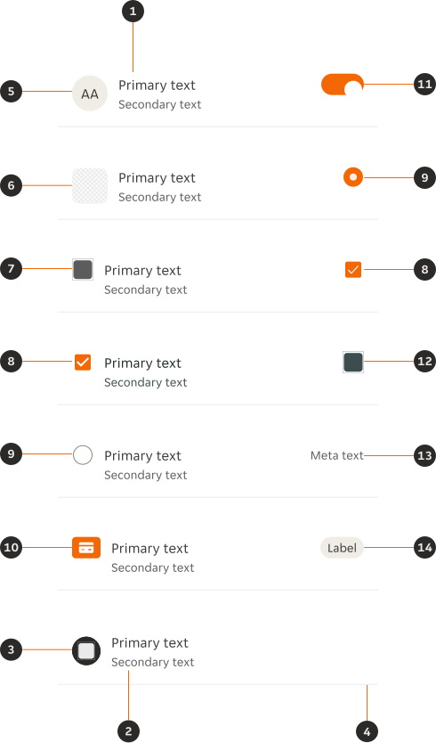
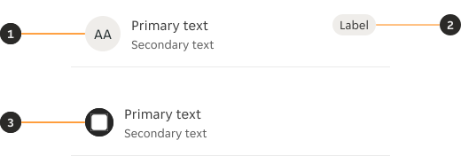
- Primary text: Gives the users an overview of the content, aiming to be contained within one line.
- Secondary text (Optional): Provides additional detail if required, aiming to be contained within two lines.
- Leading icon with background (Optional): Non-interactive icon with a background that can be used to visually support the primary text.
- Divider (Optional): Helps visually define the end of a list item and the beginning of the next one.
- Avatar (Optional): Placeholder to be replaced with a close-up photo of a person.
- Thumbnail (Optional): Placeholder to be replaced with an image.
- Leading icon (Optional): Non-interactive icon that can be used to visually support the primary text.
- Checkbox (Optional): Allows users to select none, one, or more items from the list. Left or right alignment should be consistent through the pillar.
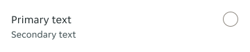
- Radio (Optional): Allowing the user to select a single option from the list. Left or right alignment should be consistent through the pillar.
- Payment icon (Optional): Non-interactive payment icon that is used to visually support a payment method.
- Switch (Optional): Used to quickly switch between two possible states.
- Trailing icon (Optional): Interactive icon (i.e. a bin or drag), but is not to be used as a secondary CTA.
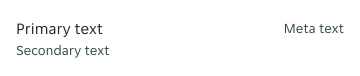
- Meta text (Optional): Highlights basic information about the List item.
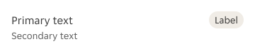
- Tag (Optional): Used to highlight special conditions like 'sold out'.
Variants
Non-interactive
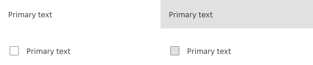
The non-interactive variation should be used when the list item doesn't require any component level interactive states tied to the instance.

Interactive
The interactive variations should be used when the list item requires component level, or nested component level interactive states tied to the instance.
Modifiers
Compact

Secondary text
The secondary text can be used to provide additional content that supports the primary text.

Bold primary text
There's an option to use bold in the Primary text.

Leading content (Non-interactive)




Thumbnail
Not available in the Compact variant.

Leading content (Interactive)

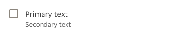




Thumbnail
Not available in the Compact variant.

Trailing content (Non-interactive)

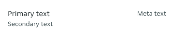
Tag
Alignment should be consistent through the pillar.
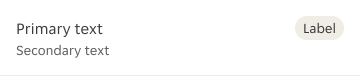
Trailing content (Interactive)

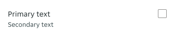

Divider
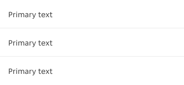
The divider is used to visually separate individual list items from each other. Dividers should never be used on the last item within a group.
Overrides
Variants
- Avatar: The Avatar's variants can be overridden.
- Tag: The Tag's variants can be overridden.
- Icon with background: The Icon with background's variants can be overridden.
Alignment / Layout
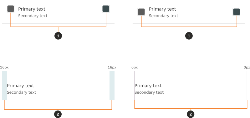
- Alignment: The vertical alignment of both leading and trailing content can be adjusted to centre alignment. However, both must maintain the same alignment.
- Vertical spacing: Vertical padding can be removed when being used within a component e.g. Modal, Bottom sheet.
Selected state
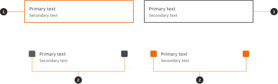
- Border colour The border colour token can be overridden with
$color-border-selected. - Icon colour: The icon colour token can be overridden with
$color-content-brand-solid.
Layout
Stacking
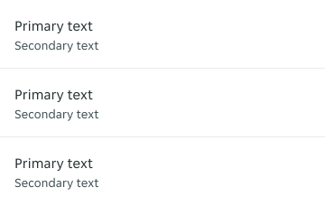
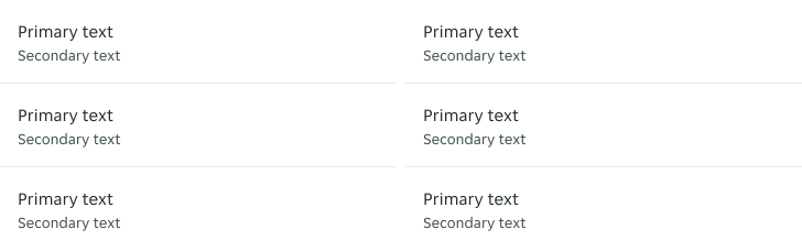
List items can be vertically stacked and horizontally, and if dividers are being used; it is suggested that the last item's divider is removed.
Form controls
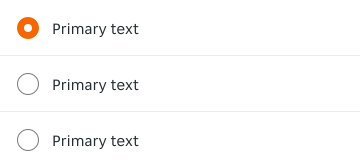
The radio form controls should always be used within a group, allowing users to make a single selection from a predefined set of options.
Sizes
Depending on the properties applied to the component, the minimum height of the component fluctuates.
| Compact | Secondary text | Minimum height | Notes |
|---|---|---|---|
| No | No | 56 px | One line of primary text. |
| No | Yes | 76 px | One line of primary and secondary text. |
| Yes | No | 48 px | One line of primary text. |
Placement
Inset container
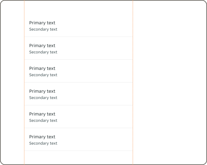
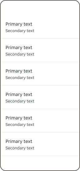
List items at both wide & narrow can be full width of an inset container.
Device container
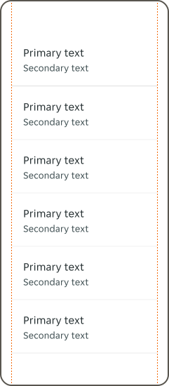
Only List items at narrow have the option to be the full width of the device.
Interactions
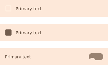
The entire container for interactive variants is clickable.
Overflow
Primary and secondary text
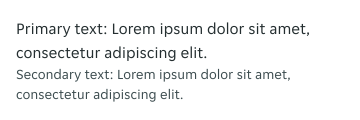
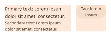
The recommendation is to keep the copy short and concise to allow users to easily browse. If the length of the primary or secondary text exceeds the available horizontal space, the content will wrap onto a new line with no maximum.
Trailing content
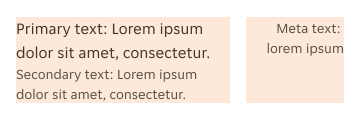
If the trailing content contains a text element, it's maximum width is 1/3 of the available space. If the width is exceeded the content will wrap onto a new line.
States
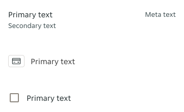
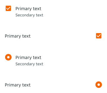
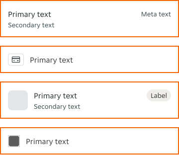
The list item allows for two states: unselected and selected. By default, the $color-border-select-brand is used.
Unselected
Selected
Interactive states
The interactive variation includes all interactive states, while the non-interactive variation only includes the default and disabled states.
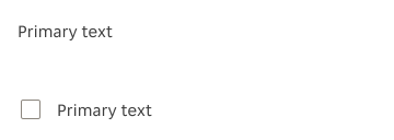
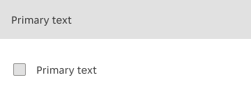
Disabled

Examples
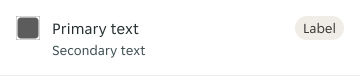
LTR example
Here are some examples of a list item component in LTR context:

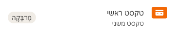
RTL example
Here are some examples of a list item component in RTL context:

Accessibility
Text scaling
Text with critical information should wrap to the next line to ensure understandability. Truncation might happen but it should be kept to a minimum.
In case truncation happens on important information offer an alternative for the user to read the full content. For example, add a “see more” link button to expand the container and provide access to the content.