- Use recognisable, simple icons that clearly communicate the FAB's action.
- Ensure the FAB highlights the most important action on the screen.
FAB
A floating action button (FAB) is a button that hovers above the content of a user interface, appearing as if it is floating over it.
Dos and Don’ts
- Ensure the FAB doesn't block navigation buttons, key content, or interfere with the user's flow.
- Use the FAB only when it's necessary and adds real value, avoiding redundancy with other UI elements.
Anatomy
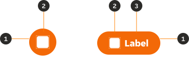
- Container: The FAB is in an elevated container.
- Icon: Visually supports the label.
- Label: Informs the user of the action.
Variants
Compact
The compact FAB should be used when an icon can easily communicate the action.

Extended
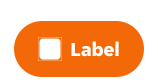
The extended FAB should be used when a label is required to communicate the action.

Modifiers
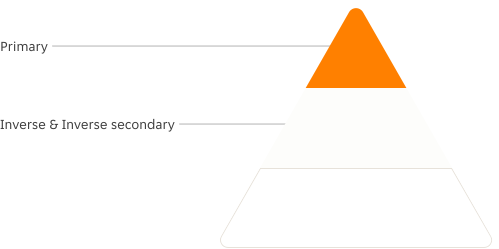
Primary
The primary call-to-action on the page should be singular and prominent, limited to one per page.


Inverse
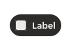
Inverse FABs are specifically designed to be used on backgrounds with colours or images.


Inverse secondary
Inverse secondary FABs are similar to the inverse FABs, but are less prominent due to the icon's use a neutral colour.


Sizes
Outlines the FAB sizes that are available, and where they should be used across our products.
Compact


| Size | Icon size | Height | Width | Notes |
|---|---|---|---|---|
| Large | 28px | 56px | 56px | Large is the default size of the component and should be the first choice whenever possible. |
| Medium | 24px | 48px | 48px | |
| Small | 24px | 40px | 40px | Small is used for pairing with multiple FABs and for instances using small screens. |
| XSmall | 20px | 32px | 32px |
Extended


| Size | Icon size | Height | Width | Notes |
|---|---|---|---|---|
| Large | 24px | 56px | Flexible | Large is the default size of the component and should be the first choice whenever possible. |
| Medium | 24px | 48px | Flexible | |
| Small | 24px | 40px | Flexible | Small is used for pairing with multiple FABs and for instances using small screens. |
| XSmall | 20px | 32px | Flexible |
Content
Labels
Labels within the FAB should clearly indicate the action and describe what will occur once the user clicks the FAB.
Use sentence-style capitalisation (only the first world in a phrase and any proper nouns capitalised).
Icons
It is essential to ensure that the icon clearly conveys the intended action of the FAB. The icon should be directly related to the action the user is taking, helping to reinforce the FAB's purpose.
Overflow
Singular word overflow
When a single word extends beyond the the available horizontal space, the word truncates and an ellipsis is displayed.

Multiple words overflow
When a group of words extends beyond the available horizontal space, the text automatically wraps onto a new line, with no maximum height restriction.

Position
FABs should generally be aligned to the bottom-right of the screen. Due to being elevated and fixed this placement should remain consistent as the scrolling is active.
LTR position
FABs should typically be positioned in the bottom-right corner and always remain within the main content area of the screen, ensuring they do not overlay navigational elements.
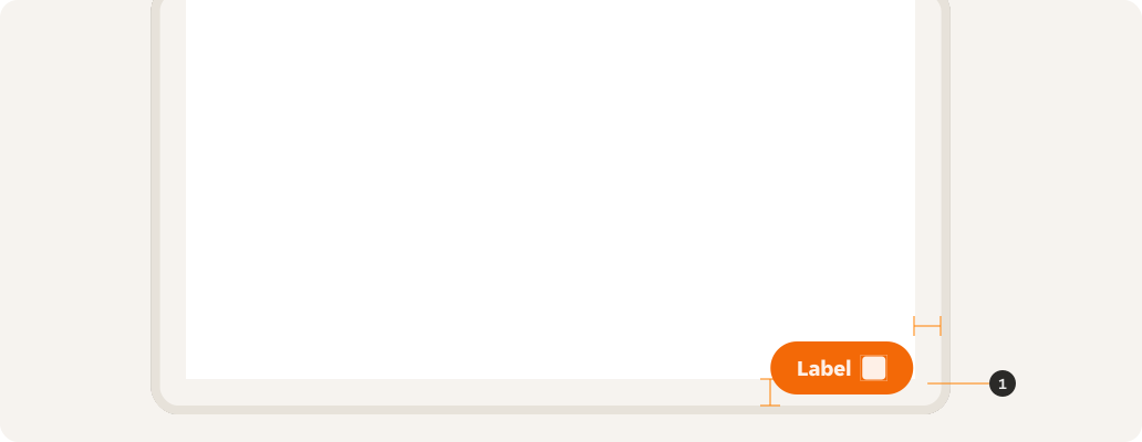
- 24px padding.
RTL position
FABs should typically be positioned in the bottom-left corner and always remain within the main content area of the screen, ensuring they do not overlay navigational elements.
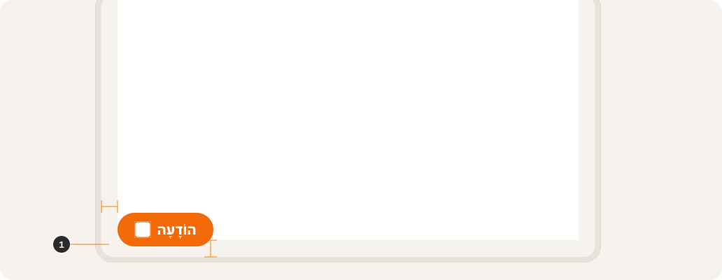
- 24px padding.
Hierarchy
FABs should follow a hierarchy of importance with regards to the action that is being committed by the user and how the FABs are paired together.
Behaviours
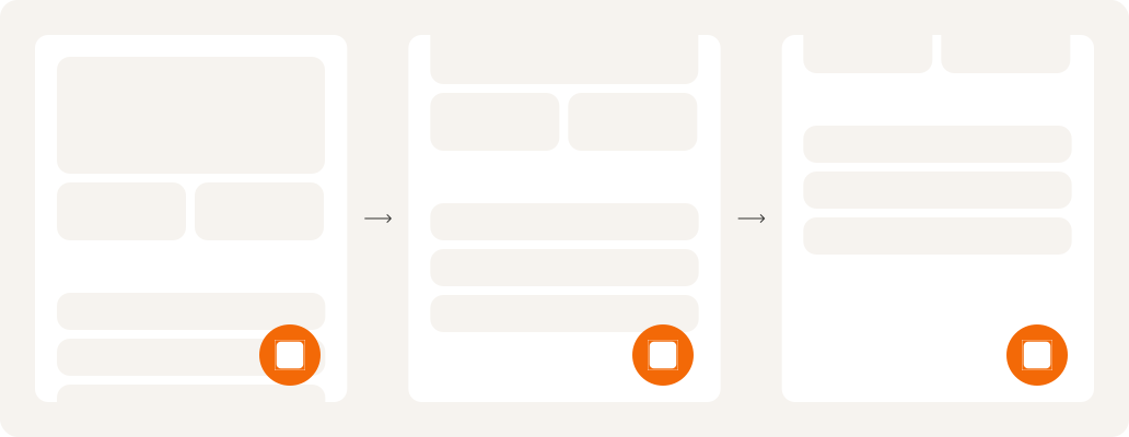
Scrolling
FABs remain in place during scrolling. They are persistent on the screen regardless of the actions taken.
Triggered content
A FAB can trigger a variety of different primary actions through modal overlays, launching forms, expanding menus, triggering navigation or child FABs.
The FAB is flexible and can complement a range of components depending on the context and needs of the situation.
Interactive states
Outlines the atomic level interactive elements for the component.



Examples
LTR examples
Here are some examples of the component in left-to-right context.


RTL examples
Here is an example of the component in right-to-left context.