Checkbox
A checkbox is an interactive element that allows users to select or deselect an option.
Anatomy
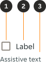
- Checkbox: A Checkbox input indicating the appropriate state. By default it is unselected.
- Label (Optional): Describes the item you want to select or unselect.
- Assistive text (Optional): The assistive text provides additional instructional information / error / success messaging.
Variants
Default

Modifiers
Label - without

Label positioning
Place labels in the trailing position by default. Use a leading label when the design requires more flexibility. Only one label is allowed to be present.


Assistive text
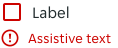
Assistive text is used where needed to provide additional information or error / success messaging. The assistive text is always used for an error state to provide the user with the information required to complete the form element.

Alignment
If there is a Checkbox grouping, they can be laid out vertically or horizontally depending on the use case; with the option of a label. When possible, arrange the Checkbox group vertically for easier reading.


Content
Checkbox labels
- Always use clear and concise labels for Checkboxes.
- Be explicit about the results that will follow if the Checkbox is selected.
Overrides

- Label: The label can include a link, when the string is a complete sentence or more.
Overflow
- If you are tight on space, consider rewording the label.
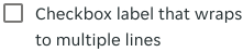
- Long labels may wrap to a second line, and this is preferable to truncation - text should wrap beneath the Checkbox so the control and label are top aligned.
Layout
Fill container
By default label container is set to hug. Designers can set the textbox to fill the container when using a leading label. This allows the layout to adapt more flexibly to different designs.




Interactions
If the checkbox has a label, the label is clickable for easier interaction.


Links
If the label contains a link, the link has its own touch target, while the standard text remains selectable for the checkbox control.


States
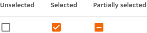
The Checkbox input allows for three states: unselected, selected, and partially selected. The default view of a set of Checkboxes is having no option selected.
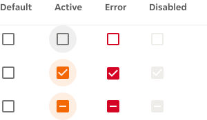
Interactive states
Outlines the atomic level interactive elements for the component.
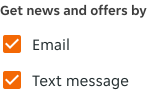
Examples
Potential use cases for the component.

RTL Examples
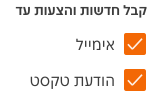
Here are some examples of Checkbox in RTL context.