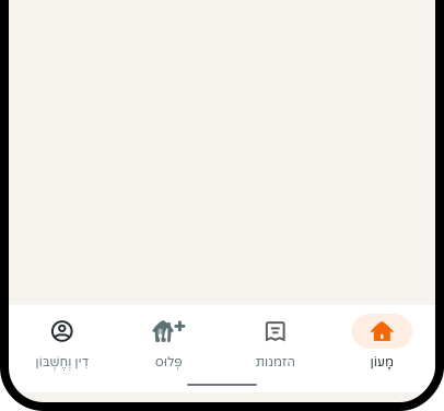
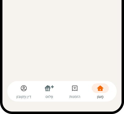
- Use minimum 3 and maximum 5 tabs for navigation across the app.
- Make the navigation bar always visible. The exception is when an overlay is opened.
- Use a clear visual hierarchy to indicate the currently active destination.
Bottom Navigation
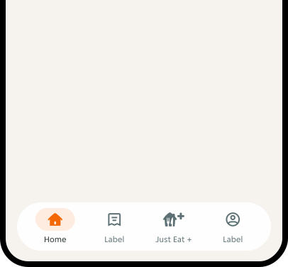
The bottom navigation allows users to quickly navigate from one section of the app to another.
Dos and Don'ts
- Don't change the tabs for a specific user flow. The navigation bar should be consistent across app screens.
- Avoid using complex icons. Ensure the icons are simple and universally understood to minimise confusion.
- Avoid long or complex wording; keep labels concise and direct.
Anatomy
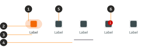
- Container: Provides a filled background.
- Icon (selected): The icon is always filled and is visually distinguished from the inactive ones.
- Label: Describes the purpose and function of the tab to provide clarity, especially for less common or ambiguous icons.
- Home indicator: Navigation bar for accessing core system functions on Android.
- Icon (unselected): Visually supports the label and doesn't have a fill.
- Notification badge: Displays notifications, or counts on navigation items.
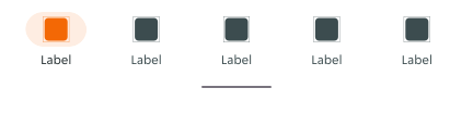
Variants
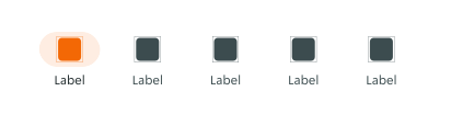
Content
Label
Labels should always be one word with clear meaning to aid navigation through the app. Avoid long or complex wording; keep labels concise and direct.
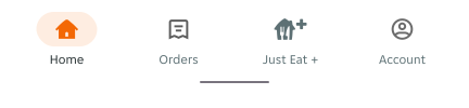
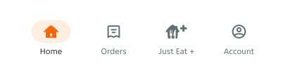
Notification badge
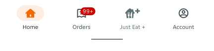
Badges appear on top of the icon. They show the number of notifications in a specific tab. The badge will change size depending on the number of digits contained without changing position.
Position
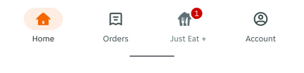

Character count
- Allow for a maximum of 2 digits.
- A plus (+) sign should be used if the number is higher than 2 digits.
Overflow
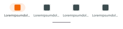
Labels should not go over one line of text. If they do the text will truncate. Avoid this happening by keeping text label succinct and testing any translations across devices. Use alternative titles if translations are too long.
Placement
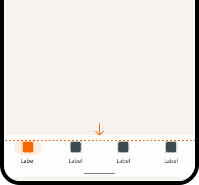
Docked
It's anchored at the bottom of the screen.
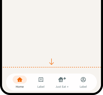
Floating
Sits on top of content with 16px vertical and 24px horizontal padding.
Interactions
Touch targets
Defines the touch targets of interactive elements across variants.
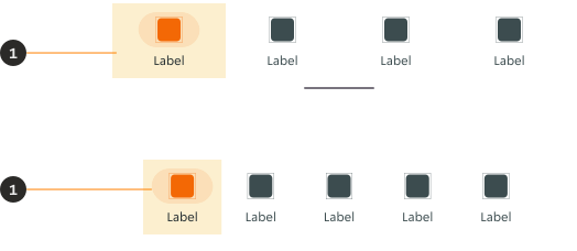
- Active tab: Navigates to a section in the app.
Interactive states

Examples
LTR examples
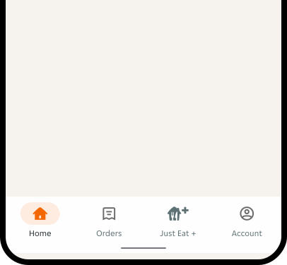
Here are some examples of the Android Bottom navigation in left-to-right context.
RTL examples
Here are some examples of the Android Bottom navigation in right-to-left context.