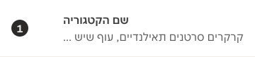
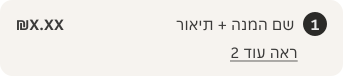
- Badges are usually placed before or after the label of the thing they're quantifying.
- Use multi-digit variant for numbers greater than 10.
Badge
A badge is a small graphical element used to display a numeric value or count.
Do's and don'ts
- Don't use for alphanumeric content — use the Tag component.
Anatomy
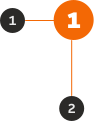
- Label: Numeric informative information to the user.
- Container: Background container that organises the information.
Variants
Brand

Primary

Secondary

Inverse

Size
Outlines the badge sizes that we use, and where they should be used across our products.
| Example | Size | Height | Notes |
|---|---|---|---|
 | XLarge | 40px | Available for all types. |
 | Large | 32px | Available for all types. |
 | Medium | 24px | Available for all types. |
 | Small | 16px | Available for all types except for Brand as it is not accessible. |
Behaviour
If the user has control over changing the Badge's quantity, and changes from '9' to '10' the width of the container will grow to accommodate the wider content.

Content
- Content should be single-digit or multi-digit number.
- It doesn't accept decimal numbers. The number should be always rounded up.
- It doesn't accept special characters.
- In certain use cases, it accepts up to one character that supports the numeric value, but the character cannot be used on its own.

States
Each variant of the badge has two states: default and disabled.
Brand


Primary


Secondary


Inverse


Narrow
Narrow variants use Narrow tokens for text. Narrow text tokens are smaller than wide and are suitable for smaller screens.

Examples
Potential use-cases for the component.
LTR examples
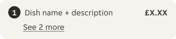
Here are some examples of the badge in left-to-right context:


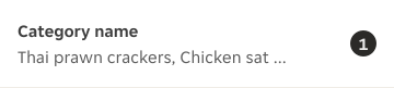


RTL examples
Here are some examples of the badge in right-to-left context: