- Prioritise initials avatar over user icon avatar for individuals.
- Make sure you use the correct size for its placement, whether it's in a list, stand-alone, or any other context.
- Always maintain equal width and height dimensions.
Avatar
An avatar is a visual representation used to identify and personalise a user or entity within a user interface.
Do's and don'ts
- Don't use the initials avatar for a non-individual entity (e.g. a company).
Anatomy
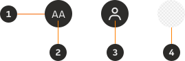
- Container: Background container that organises the information.
- Initials: Displays the user's first and last name initials.
- User Icon: It can represent any entity, such as a user or a business.
- Photo: Displays a picture of the user.
Variants
Initials
Use the initials avatar variation when you want to represent an individual user. Use it only when the name is known.

User Icon
Use the user icon avatar variation when you want to represent an individual user whose name has not been specified, or for non-individual entities such as companies, teams or groups.

Photo
Use the Photo avatar variation when you want to display a picture of the user.

Unauthenticated
Use the unauthenticated variation when the user hasn't logged in or authenticated their session yet.

Modifiers
Emphasis
Depending on the level of visual prominence you want to give to your avatar, you can choose between strong or subtle emphasis.


Colours
Select from a palette of distinct brand colours for your avatar.


Outline
You can apply an outline to the Photo variant, which helps with clarity and gives a good contrast to the avatar.

Interaction
Interactive
An avatar should be interactive when it serves a specific purpose or action within the user interface.

Non-interactive
Use the avatar in a static form, if you want the avatar to retain its original appearance without any interactive features tied with the content or context.

Sizes
Small (S)
Height and width of 24px.

Medium (M)
Height and width of 32px.

Large (L)
Height and width of 40px.

X Large (XL)
Height and width of 56px.

Content
Initials
Use the first letter of the user's first and last name as the initials in the avatar, limited to a maximum of two capital letters. The letters should always be centre-aligned.


Interactive states
Default

Active

Disabled

Examples
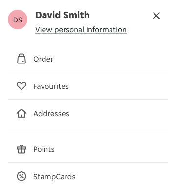
Here are some examples of Avatar in context: