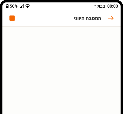
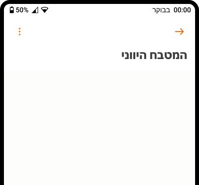
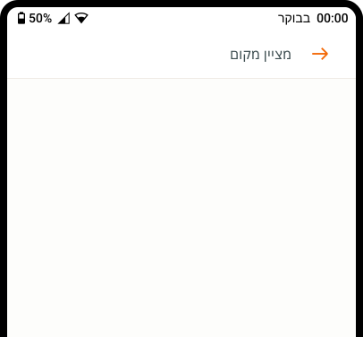
- Use to display page titles and additional functionality.
- Use native Android scrolling behaviours.
App Bar
A surface that displays at the top of the screen, providing navigation, actions, and text.
Dos and Don'ts
- Do not use anywhere other than the top of the screen.
- Do not use images behind transparent heading text.
- Never break from the app bar component. It is essential to the product architecture.
Anatomy
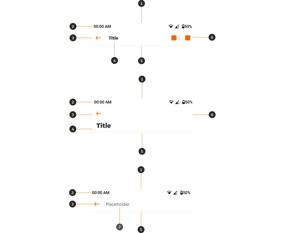
- Container: Provides a filled or transparent background.
- Android status bar [native]: Native element that displays device current information.
- Leading controls: Option of three controls (back, menu, close) to aid user navigation.
- Title (optional): Provides an optional heading for the page content.
- Divider (only on filled variants): Separates the app bar from content.
- Trailing controls (only in title variants): Provides optional overflow menu icon or choice of up to two custom icons to aid user navigation.
- Search input (only on search variant): Allows users to search product content; option of placeholder or search text.
Variants
Filled
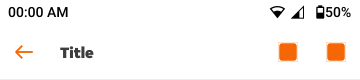
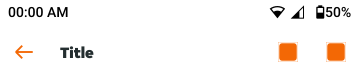
A filled background provides a tokenised container for the app bar content and titles, which should be used as default.
Transparent
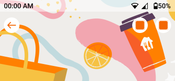
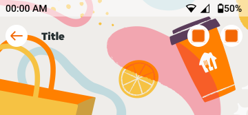
A transparent background allows the page background or image to be visible, allowing for more creative app bar solutions. Inverse icon buttons are used in app bars with transparent background to ensure they are easily visible against any content beneath.
If using the transparent variant above a page background colour you may need to do additional checks to make sure the text is accessible. If using the transparent variant above an image, please ensure titles are hidden.
We suggest setting a 50% opacity behind status bar content to make it more visible, as this is a system setting this is not controlled through PIE and must be actioned on the consumer side.
Modifiers
Title
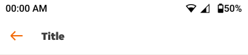
Regular
Use as default to provide screen navigation, we allow titles to be hidden for certain use cases but we must always have a title to ensure screen reading accessibility.
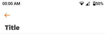
Prominent
Use when you need to make a title more prominent.
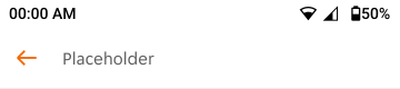
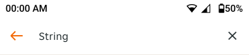
Search
Can be used when you need to use high level search functionality. Use placeholder option to show placeholder text, use string to show when a user has entered a string of text.
Do not allow the search functionality if you’re using the prominent variant, we only allow the search functionality to be accessed via the regular title variant.
Leading controls
We always use leading controls to assist with navigation. There are three options to choose from.
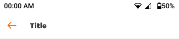
Back
Aligns with native behaviour, allowing users to navigate back to the screen before.
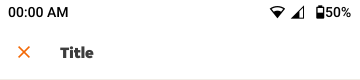
Close
Aligns with native behaviour, allowing users to close the application or view.
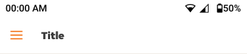
Menu
Allows users to open a side-sheet menu, used on tablet rather than mobile.
Trailing controls
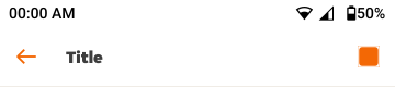
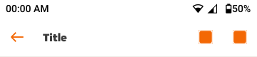
You can use up to two icons in the trailing controls to aid user navigation and provide additional functionality.
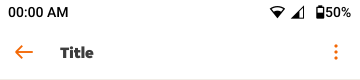
Overflow menu
Aligns with native behaviour, allowing users to open a native overflow menu that hides additional functionality. When paired with another icon the overflow menu always appears to the right.
Custom icons
We allow up to two custom icons within our trailing controls, these are available only to provide additional functionality to the app bar component.
Placement
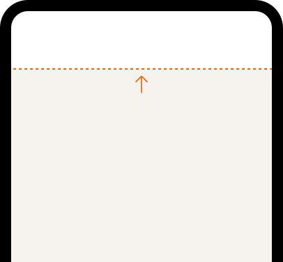
The app bar always sits flush to the top of the screen, and over the page content.
Content
Titles
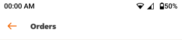
Titles should be used as default; they should always be clear, succinct, and provide the relevant content to aid a user's navigation of the app.
Overflow
Titles
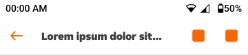
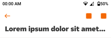
Titles should not go over one line of text. If they do, the text will truncate. Keep text succinct and test any translations across devices. Use alternative titles if translations are too long.
Search
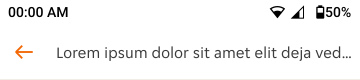
If placeholder text exceeds the length of the search input container, it will truncate. Please avoid this by keeping placeholder text succinct and by testing placeholder text translations.
String variants should never have overflow solutions. See Behaviours for when a user types a string of text that is longer than the search bar container.
Behaviours
Scrolling
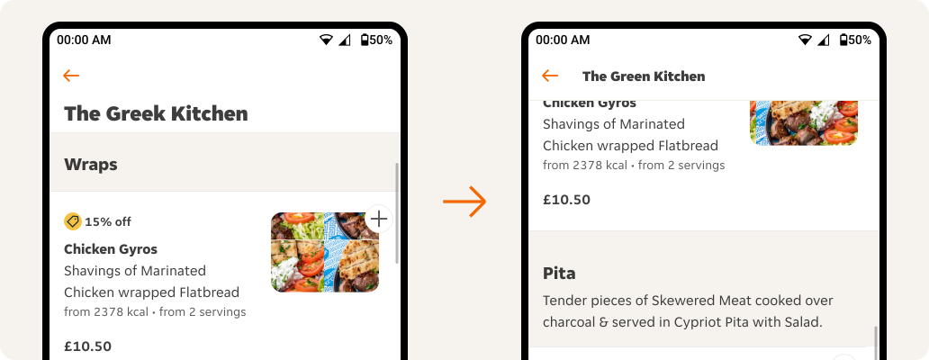
When scrolling through the page content we only allow filled background variants to remain sticky at the top of the screen, allow the content to scroll beneath.
We also allow app bar with prominent text to change to non-prominent text upon scrolling to allow for more space on the screen.
Search bar
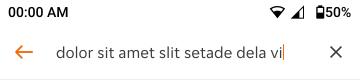
When typing, a text cursor (not visible in design) indicates where text will be placed when entered.
If the user inputs a string of text longer than the container, the search input will scroll automatically so the user will continue to see what they are typing.
Overflow menu
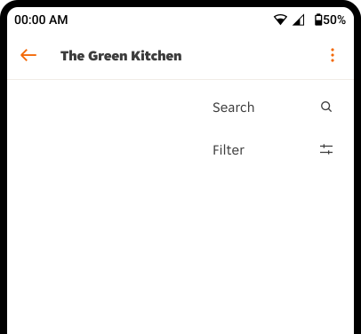
Use the native Android menu component to provide an overflow menu solution. The overflow menu can be activated using the overflow menu icon provided in the trailing controls.
Interactions
Touch targets
Defines the touch targets of interactive elements across variants.
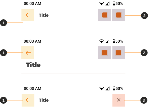
- Navigation: Navigates to the previous screen, closes a modal stack, or opens a menu.
- Select: Allows for selections within the screen.
- Clear: Clears a search query.
Examples
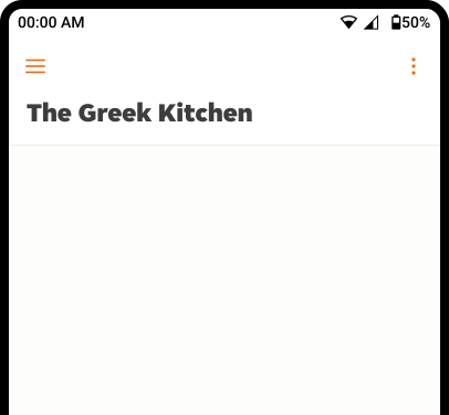
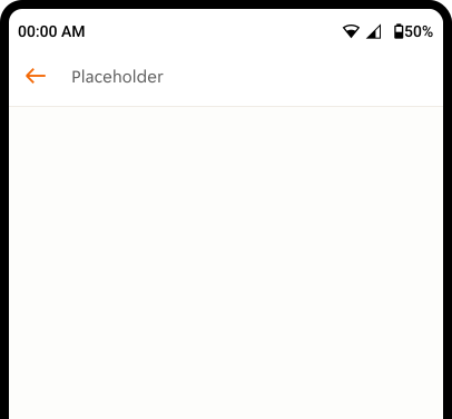
LTR examples
Here are some examples of the App bar in a left-to-right context.
RTL examples
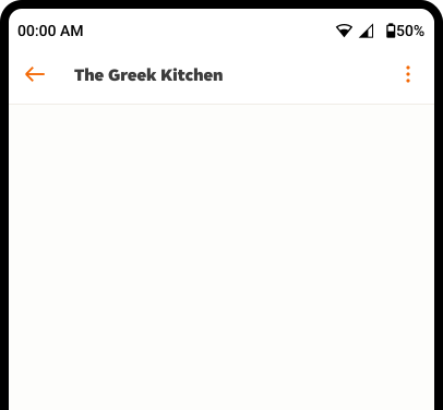
Here are some examples of the App bar in a right-to-left context.