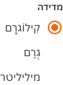
- Ensure each radio button has a concise and descriptive label that clearly indicates what selecting it will entail.
- Use a minimum of two radio buttons within a group.
Radio Group
A radio group is a set of individual radio buttons grouped together, allowing users to select only one option from the set.
Dos and Don'ts
- If the user can select multiple option from a group, checkboxes should be used instead of radio buttons.
- Limit the number of radio buttons presented to users to avoid overwhelming them with choices.
Anatomy
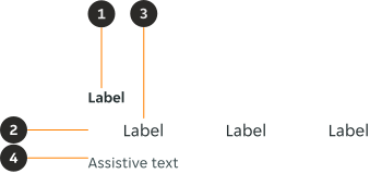
- Form label (Optional): A form label provides necessary content / information to a form.
- Radio input: A radio input indicates the appropriate state. By default it is unselected.
- Radio label: Describes the information you want to select or unselect.
- Assistive text (Optional): The assistive text provides additional instructional information, error or success messaging for the whole radio group.
Variants
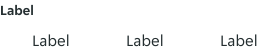
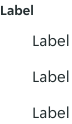
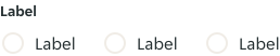
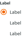
Radio groups can be laid out both horizontally and vertically depending on the use case and the structure of the UI. Where possible, arrange the radio group vertically for easier reading.
Horizontal
Vertical
Modifiers
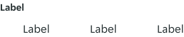
Form label
A form label is recommended to provide the user context of the form element and it's content.
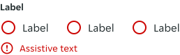
Assistive text
Assistive text is used where needed to provide additional information or error / success messaging regarding the whole form element, and never to individual checkboxes. The assistive text is always used for an error state to provide the user with the information required to complete the form element.
Content
All content should use sentence case.
Form label
Label
- Always use clear and concise labels for checkboxes.
- Labels appear to the right of checkbox input.
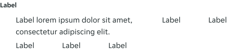
Overflow
When the label exceeds the available width, the label will wrap onto a new line. Radios with the same row remain top aligned for consistency, and any additional rows underneath move down to accommodate the additional content.
States
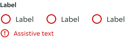
Individual radios have their own interactive states: default, hover, active, and focus. However, some states apply to the group as a collective because they affect all radios: error and disabled.
Examples
LTR examples
Here are some examples of the radio group in left-to-right context:
RTL examples
Here are some examples of the radio group in right-to-left context: