- Use standalone links to allow users to navigate to different pages within your product.
- Use standalone links to allow users to navigate to an entirely different website.
Link
A link is an interactive element in a user interface that allows users to navigate to another resource or location, typically on the web.
Dos and don’ts
- Don’t use standalone links as calls to action. Use buttons instead.
- Don’t use standalone links for actions that will change elements in a screen. Use buttons instead.
- Don't use the reversed styling when surrounded by regular text, as it will get lost.
Anatomy

- Label: Text label informing the user about the nature of the link.
- Icon (Optional): Leading or trailing icon.
Variants
Default
Should be used as the default colour for all our links.

High visibility
Uses a blue colour to increase the visibility of the link.

Inverse
It should be used in areas where an inversed background is used, or when contrast between the default or high visibility links isn’t sufficient to pass accessibility rules.

Inverse light
Inverse Light should be used in areas where in both light and dark mode, a dark container/background is being used for high contrast and to meet accessibility rules.

Modifiers
Emphasis
Links can be de-emphasised by using their non-bold variant. When doing that, make sure these can still be identified as links. You can achieve that by:
- Adding a leading or trailing icon.
- Using the high visibility variant of the link.
- Using the default underline variant of the link.


Styling
The underline in standalone links can be removed to achieve a more minimal look. This variant can be used when the link is repeated in a list or navigation. However, whenever you do that you’ll need to make sure they can still be identified as a link by ensuring it has enough emphasis.


Icon
You can use icons to reinforce the action that will take place when the user interacts with a standalone link. On the high visibility variant of the link the icon needs to use the same colour as the link.


Sizes
Height
Both Medium and Small links have a minimum height of 32px. Height will increase if the content overflows.



Width
Link has a minimum width of 48px.

Content
- Use sentence-style capitalisation (only the first word in a phrase and any proper nouns capitalised).
- Make sure the words you convert into links are directly related to the contents that the link will lead you to.
- Use descriptive and meaningful text to the link.


Overflow
When the copy exceeds the available width, it will wrap onto a new line. Content will be centre-aligned.

Interactive states
Outlines the atomic level interactive elements for the component.


Examples
Outlines the atomic level interactive elements for the component.
LTR examples
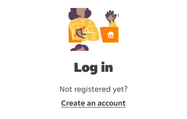
Here are some examples of links in left-to-right context:

RTL examples
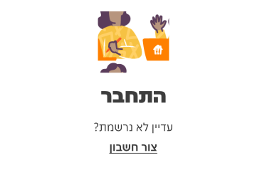
Here are some examples of links in right-to-left context: