Iconography
Icons are graphic symbols that are used to represent concepts, objects or actions.
Overview
- Our packages
- Web Components (pie-icons-webc)
- Vanilla JS (pie-icons)
- iOS library and naming conventions
- Android library and naming conventions
Our packages
We have a number of different icon packages available for use in our applications. We have a package for each framework we support, as well as a base package for the icons themselves.
Web Components (pie-icons-webc)
This package generates a framework-agnostic Web Component icon set for web applications. It uses the base pie-icons package. The SVGs in pie-icons are compiled into Lit web components.
Usage
Installation
npm install @justeattakeaway/pie-icons-webc --save
yarn add @justeattakeaway/pie-icons-webc
Import into your project
We suggest importing the bundle for an individual component directly.
import '@justeattakeaway/pie-icons-webc/dist/IconAppRestaurant.js';

export class MyAmazingComponent extends LitElement {
  render () {
    return html`
      <h2>
        This is a heading
        <icon-app-restaurant size="xl" />
      </h2>`;
  }
}
Size
Icons are made available in different size variants:
- small
- large, when its name has the
Largesuffix
Small icons default size is xs and can use one of the following pre-determined values for size: xxs, xs, s, m, l, xl, and xxl. You can learn more about small icon sizes here.
Large icons size default and minimum value is 32. Values larger than the minimum must be multiples of 8, otherwise they will fallback to the default value. You can learn more about large icon sizes here.
Example:
<IconAlertTriangle size="l" />
<IconAlertTriangleLarge size="40" />
Vanilla JS (pie-icons)
@justeattakeaway/pie-icons is our base icon package, from which our other icon packages extend.
It is essentially a collection of the SVG files that make up the PIE Iconset. This means that you can use these icons in all the same ways you can use SVGs (e.g. img, background-image, inline, object, embed, iframe).
This package also provides a JavaScript API for the iconset, and this is what is used to build the framework-specific icons for Web Components, React and Vue.
pie-icons package can be used for web applications, we strongly advise that you use one of our framework-specific implementations instead. Usage - Client-side Javascript
To use the icons in your application, you need to include the package in your project, add the icons using data-attributes and invoke the replace() function:
Installation
You can install the package using npm or yarn:
npm install @justeattakeaway/pie-icons --save
yarn add @justeattakeaway/pie-icons
Include the package
You can load directly from the installed package, or from a CDN provider.
<script src="path/to/dist/pie-icons.js"></script>
<!-- choose one -->
<script src="https://unpkg.com/@justeattakeaway/pie-icons"></script>
<script src="https://cdn.jsdelivr.net/npm/@justeattakeaway/pie-icons/dist/pie-icons.min.js"></script>
HTML
Simply add a data-pie-icons attribute with the icon name to an element. You can see all of our icons on the library page.
<i data-pie-icons="menu"></i>
Invoke the package
Calling the replace() function will replace all elements with the data-pie-icons attribute with the relevant icon.
<script>
  window['pie-icons'].default.replace();
</script>
Usage - NodeJS
Installation
You can install the package using npm or yarn:
npm install @justeattakeaway/pie-icons --save
yarn add @justeattakeaway/pie-icons
Import the package
Simply import the package in your application where needed:
import pieIcons from '@justeattakeaway/pie-icons';
Call the APIs
The package exposes a number of APIs for you to use:
const { icons } = pieIcons.default;

icons.x
// {
//    name: 'x',
//    contents: '<line ... /><line ... />`,
//    tags: ['cancel', 'close', 'delete', 'remove'],
//    attrs: {
//      class: 'c-pieIcon c-pieIcon--x',
//      xmlns: 'http://www.w3.org/2000/svg',
//    },
//    toSvg: [Function],
// }

icons.x.toSvg()
// <svg class="c-pieIcon c-pieIcon--x" ...><line ... /><line ... /></svg>

icons.x.toSvg({ class: 'foo bar', 'stroke-width': 1, color: 'red' })
// <svg class="c-pieIcon c-pieIcon--x foo bar" stroke-width="1" color="red" ...><line ... /><line ... /></svg>
iOS library and naming conventions
iOS packs all icons into the JustUI core library. Our iOS library will use the same name of the icon, but transforming it from kebab-case to CamelCase (removing the hyphens).
For example, the gift-filled-large icon would be giftFilledLarge.
Android library and naming conventions
Use the latest version
In order to get all the PIE Icons in your app, you’ll need to include the com.jet.pie2:icons library in your gradle module.
Library versions are controlled via a Bill of Materials (BOM), that will ensure all PIE libraries use a compatible version.
This will handle all versions for you, BOM version: 2025.01.00 or higher:
implementation(platform("com.jet.pie2:bom:$latestBOMversion"))
Access to all PIE Icons:
implementation("com.jet.pie2:icons")
Access to all PIE illustrations:
implementation("com.jet.pie2:illustrations")
Access to all PIE Logos:
implementation("com.jet.pie2:logos")
Get the information directly from Figma
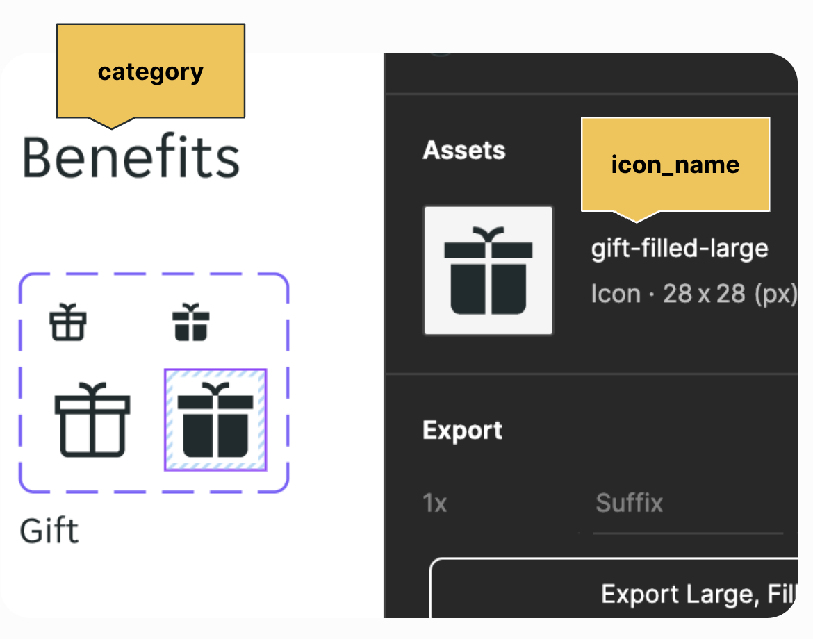
Naming convention for icons: ic_pie_{category}_{icon_name}.
For example, the icon below would be ic_pie_benefits_gift_filled_large and available as
@drawableic_pie_benefits_gift_filled_large or R.drawable ic_pie_benefits_gift_filled_large.
Tint the icons with the correct colour token
Icons come with a fuchsia tint by default, so it is your responsibility to make sure they look correct in both Light and Dark themes. To do so, get the colour token from Figma and apply it directly to the icon.
contentDefault as your default design token colour for tinting your icon if you are unsure. This will make sure that the icon looks neat in both Light and Dark modes. Please check with your designer/Figma files that you are using the right token for the icon. Example for XML Views:
android:drawableStart="@drawable/ic_pie_alert_info_help_circle_filled_large
android:drawableTint="?attr/jetColorContentDefault"
or
app:srcCompat="@drawable/ic_pie_chevron_chevron_down"
app:tint="?attr/jetColorInteractivePrimary"
Example for Jetpack Compose:
Icon(
    ...
    imageVector = ImageVector.vectorResource(id = PieIconR.drawable.ic_pie_arrow_arrow_left),
    tint = JetTheme.colors.contentInteractiveBrand,
    ...
)
FAQs
Q: I’ve imported the library. Where can I find the icons?
A: Icons are located in their own namespace: com.jet.pie2.icons.R. You can find more information in the Android repository Wiki under the Use PIE assets section.
Q: I can’t find the icon I need. Can I add it to the library?
A: No. All icons will be automatically generated. If your icon doesn’t belong to PIE, it needs to live inside your own project.
Q: My icon belongs to PIE, I can see it in Figma. Can I add it?
A: If your icon belongs to PIE and it’s not in the library, make sure you’re using the latest version of PIE BOM. If you still can’t see it, message us via #help-designsystem Slack channel and we’ll update the icons for you.